Experimental HoHH Graphics Demo (0.01)
Added 2023-06-05 11:45:32 +0000 UTCAs mentioned in the recent update post, I've spent the last few days banging my head against various HTML/CSS guides to see if I can make House of Hellish Harlots look better than the basic Twine Sugarcube look.
On Sunday I hacked this little demo together.
It is very much a hack. I just took various passages from the NPCs to indicate the various NPC locations and added Sapoonis's scenario. It's very limited and is just to get an idea of what a 'prettier' HoHH might look like.
Some notes:
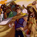
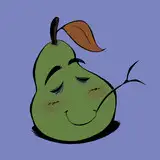
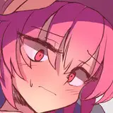
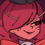
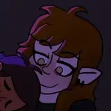
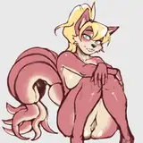
The art is all placeholders. It's either AI generated or old art commissions. The AI art is a mixed bag. Some of the portraits are okay. Some less so. As for the backgrounds, I think the pen 'n' ink style is fine, but the AI-generated nature tends to look pretty bad when blown up. It's just temporary to try things out and see how they look.
While adding Sapoonis's scenario I found out that Twine doesn't allow splitting <div> tags across passages. It's fairly easy to work around as I just moved the end options back to the initial passage and had them set as a string elsewhere. It does require a little bit of editing, so I will have to go through all 70 harlots and tweak them to make the display work. It would be a fair bit of work, so I'm not going to launch into it until I'm totally happy with how the display is looking.
Having the white text background and harlot pic being redrawn/reloaded on every passage change is less than ideal. Really, I'd like them to stay fixed and only the text change. As they're set within each passage, this might be unavoidable. If anyone with more web dev experience knows any tips and tricks to avoid the flicker/redraw effect on moving to the next page, please let me know.
This is also the first phase. It should be possible to change the sidebar/remove it altogether. My plan would be to see if I can replace that and make it look more like a game with icons on the left side of the screen the player can click on to bring up their character sheet, equipped charms, etc. That would be phase 2 of the redesign.
This is just a very rough 'n' ready demo to try some things out. The zipped folder contains a HTML and an image directory holding all the images. Double clicking the HTML file should open it up in the browser and as long as it hasn't been moved, it should load in the pics from the images directory. (Permissions on some devices might stop the HTML file from loading the images from a local directory.)
It's all very hacky to try some things out to get some feedback. Please try it out and let me know your experiences below.
Comments
It sounds like it. Bootstrap might very quickly save you time though, if it's not overkill for your needs. If you don't have an equivalent already, I'd recommend installing a Chrome extension like "ViewPort Resizer - Responsive Testing Tool". You can flick between standard viewport sizes to see how your webpage responds. Combine that with the Chrome inspector and you can test tweaking your HTML/CSS settings at different resolutions and then transfer what you discover works to your HTML/CSS.
2023-06-24 22:24:54 +0000 UTCCheers. I'll look into it. It's been a fairly intensive month learning various things. :D
Many-Eyed Hydra
2023-06-24 11:04:00 +0000 UTCI imagine some might sniff at it, but quite a few developers, particularly ones like me who spend most of their time server side but still need to achieve a good and responsive front-end in short order, use Bootstrap to save time getting to grips with CSS. I'm sure you could work out the 12 column responsive grid and various utilities (e.g. the display utility where you can hide an element above the large breakpoint just by adding d-lg-none) in a day or less and do what you'e talking about without having to write any media queries (although I end up adding some to fine tune things - just build some min-width ones using the breakpoints Bootstrap uses: xs: 0, sm: 576px, md: 768px, lg: 992px, xl: 1200px, xxl: 1400px). There are plenty of components too, such as the offcanvas sidebar.There's no need to use the Sass version either - you can just link to the CSS version.
2023-06-24 00:57:49 +0000 UTCThe display probably doesn't work on mobile. I'll need to get the max screen width and then customise the display based on that.
Many-Eyed Hydra
2023-06-13 01:02:22 +0000 UTCIsn't working on mobile?
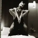
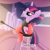
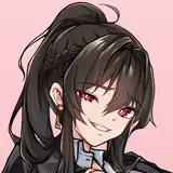
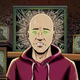
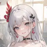
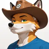
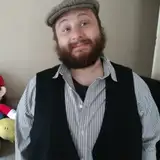
2023-06-13 00:28:02 +0000 UTCPortraits are definitely hit and miss. The AI got nowhere close with Nurse Honey, hence using some old art a reader had commissioned (which is temporary as I don't have the permissions of either them or the artist). Buxom Lolibaba is just generic witch at the moment. The Doctoress isn't bad - that roughly seems in the right area. Portly Gentleman is almost spot on - but his appearance is a very common caricature. Barman is in the right area, but I agree he needs a little more Cavil. Elegant Woman is also really tricky. I could do with getting some good art of her as mentally I always think of her as an old hag (her personality is very gossipy and caustic), when she's still supposed to be extremely hot.
Many-Eyed Hydra
2023-06-06 12:50:06 +0000 UTCI need to try out some different AI art programs (used a free version of Stable Diffusion for this). Black and White or Black and White with some colour shading (greens, blues, reds, pinks, depending on area) will fit for the backgrounds I think. I don't want them to be so detailed they pull the eye from the text/portraits/harlot art. They do need to look better at the resolution when covering the whole screen though.
Many-Eyed Hydra
2023-06-06 12:43:48 +0000 UTCYup, was expecting some issues with smartphone displays. If the screen is minimised a little, the portrait can get pushed behind the sidebar (which I'm looking to replace with a better player GUI). If it's minimised a lot, the portrait should pop up above the text, but the text box will still likely be right-aligned and look off. As Jahi06 pointed out below, there is a way to handle this. CSS has a media command to get the display width in pixels, so it should be possible to vary the display based on screen width and give smartphone users a different display. Still have a fair bit of experimentation to do! :)
Many-Eyed Hydra
2023-06-06 12:40:23 +0000 UTCOkay, on Chrome on my computer it works but it only really looks right when maximized. The character portraits just straight up disappear when it's not maximized. And the image of Sapoonis appears at the top instead of to the left of the text, when it's not maximized.
Jimmy the Cannon
2023-06-05 23:58:36 +0000 UTCFor what it's worth, this absolutely does not work on my Samsung Galaxy. Even in desktop mode on the browser it's misaligned and unusable.
Jimmy the Cannon
2023-06-05 21:57:20 +0000 UTCI like most of the portraits especially the Elegant Woman. The black and white background art is cool too (far nicer than what is presently in use), especially the Bar Interior which has a really nice Weimar nightclub vibe, the only issue is the res.
CrimsonCrown
2023-06-05 13:23:50 +0000 UTCOh wow, let me tell you, MEH. The artwork is giving me World of Darkness vibes (its especially reminding me of the famous art work of a man turning into a wolf, half-man half-wolf, and then the buff as fuck and tall werewolf with steak knives for nails from Werewolf: The Apocalypse). I'm not a fan of the Barman. He should look like a blonde Henry Cavil or Chris Hemsworth. This Barman looks like Carrot Top's brother. Buxom witch looks like Sabrina the teenage witch girl that finally grew up. Elegant Lady looks like Lady Gaga. The Doctor succubus that sells you potions looks like a techno mage straight out of Mage: The Ascension. And the Portly Gentleman looks too much like The Presence from DC Comics.
Najee
2023-06-05 12:44:57 +0000 UTC