


支援者の皆さま、ご覧いただきありがとうございます。
Thank you for your continued support, dear supporters.
※The English translation is at the bottom of the page.
忘れないうちに、自分の学習用に振り返りたいと思います。
今回の手順はこんな感じです。
1.プロット作成(グーグルスプレッドシート)
2.プロットラフ(青ラフ)
3.赤ラフ(2の青ラフを整える)
4.線画
5.トーン塗り
6.黒ベタ塗り→白ハイライト入れ
7.台詞入れ
以上となります。
同じ作業サーバーで活動しているマンガに慣れた人は、赤ラフを飛ばして線画をするので凄いです。。。
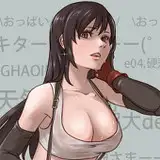
今回は「市販のマンガのような感じ」に挑戦しました。
前回のグレースケールじゃなくてトーンで色表現をがんばるぞ!と意気込みましたが、
clipstudioでは「レイヤープロパティー」から設定できてとても楽でした。
グレースケールで塗る → トーンの「パターン」「線の数」を選択 でマンガらしさが増しました。
あとは、自分の中で下記のルールで作成してみました。
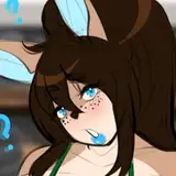
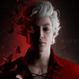
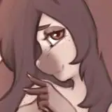
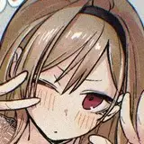
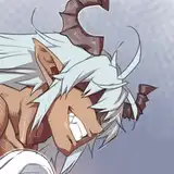
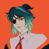
・赤城の白い吐息は、ガーゼ跡のブラシ。
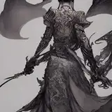
・金属の質感は湾曲部分に黒ベタ塗り。
・トーンは人体関連は「丸トーン」、衣類は「線トーン」で塗る。
・暗い色が重なっているところは、白ハイライトを入れて明確にする。
・妖艶さを出すために、キャラ全体に乗算レイヤーで薄いトーンをのせる
※最後の赤城さんだけは最初に描いたのでトーン関連のルールが守れてないですね(笑)
つたない所もあると思いますが、マンガ技術取得も地道に頑張ります。
・製作期間が長かった。
→簡略化できる箇所(服の塗り)は単純にする。
・白ハイライトの入れ方が定まっていない
・黒髪の塗り方が黒ベタ一色のほうが良いかもしれない。
・黒衣装と黒髪だと全体的に画面が暗すぎる気がする
ここまで読んでいただきありがとうございます。
【赤城の差分】をこのブログ下部にいれましたのでお楽しみください
Thank you for your continued support, dear supporters.
Before I forget, I want to look back for my own learning.
Here's the process for this time:
1.Create plot (Google Spreadsheet)
2.Plot rough (blue rough)
3.Red rough (clean up the blue rough from 2)
4.Line art
5.Tone shading
6.Black filling → add white highlights
7.Add dialogue
That's all. People who are used to working on manga in the same server can skip the plot rough and red rough and go straight to line art, which is amazing.
This time, I attempted to create a manga with a "commercial manga-like feel".
Instead of grayscale, I tried to express colors using tones, and was very happy to find that it was easy to do so in Clip Studio by adjusting the settings in "Layer Properties". By painting in grayscale and then selecting a "Pattern" and "Number of Lines" for the tone, I was able to achieve a more manga-like effect.
I also tried to follow the following rules while creating the manga:
・Used a gauze brush for white breath emitted by Akagi
・Applied black fill to curved metal surfaces to enhance their texture
・Used round tones for body parts and line tones for clothing
・Added white highlights to areas where dark colors overlapped to create clarity
・Used a multiply layer with light tones for the entire character to add a bewitching feel
(The last Akagi was drawn early on, so the rules related to tone were not followed.)
While I may have some shortcomings, I will continue to work hard to acquire manga techniques.
・The production period was long.
-> Simplify areas that can be simplified (such as clothing coloring).
・The way of adding white highlights is not yet established.
・The way of coloring black hair might be better if it's all black.
・If the costume and hair are black, the overall screen might be too dark.
Thank you for reading this far.
Last but not least, please take a look at the Akagi differential.


