SakeTami
sierralee
sierralee

patreon


September 22 Update

I've had a fairly good run of making the first public release the final release until the next major update... but this might be an exception. There are sadly some bugs in the current public version; nothing major, but they do cause problems in certain cases. Combining that with potential updates to the dialogue script and images themselves, and I think I may need to do another build.

This is all somewhat inconvenient. Does it substantially delay the next update with the optional dungeon? No, I'm always working ahead on stuff. However, it does add little complications that slow me down a bit.

For example, I need to either not add in new files or remove them before the public builds, otherwise the game files will include spoilers. Working ahead on maps is normal, as I always delete those ahead of time, but hunting through the game files or database to delete stuff is tedious. So I hope I can get things stabilized in the public release so I can fully transition to the files for version 0.76.x.

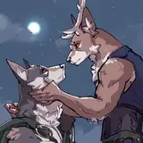
Every time I convince myself to do more maps, I always regret it. Upgrading maps either requires an absurd amount of playtesting time or leads to different classes of bug, including those mentioned above. Is there some value in the improvements? I believe so - see the above image, which I've used for promotion in a few places.

The reaction has been somewhat of a confirmation of my general concern about this: the difference between the worst and best maps I can create in RPG Maker is basically negligible. Both left and right screenshots read as "low production values" to a general audience.

I think it was worth it, because fans have enjoyed the visual updates, and I do want to polish up TLS for everyone. It's going to take me a while to convince myself to do any more maps, though. -_-

Last week I alluded to my schedule potentially being clearer as of this update and I'm pleased to report that it is. I can finally catch up on things and devote more time to moving forward!

September 22 Update

Comments

it's amazing how far the game has come, and seeing all of these first added areas getting visual updates and custom textures is very satisfying polish to match the quality of the game it presents!

Barissia

> My point is that more visual literalism is nice, but the audience doesn't expect it for games like this. [...] I'm not convinced this is a problem that needs to be fixed Oh, I agree with that. But a showcase is like a resume: It's better not to outright lie. But you don't need to put forward the least admirable parts. > The black void is definitely something that others games do It's undeniably not an evil technique in itself, and is perfectly adequate in a lot of circumstances, including, in essence, this one. It's more a question of how much and how often the screen requires padding (made of pure black or of anything else).

Rachnera

This is an interesting evaluation of technical art perspective on VX Ace. As someone who has basically never worked with VX Ace or game creation, I can only give my input as a fan and player. The examples you have of the limits of the system (Simon on the bed or the black void when showing smaller rooms) are things that don't even register as problems for me. Maybe at worst they'd be 'oddities'. Simon on the bed could be depicted as a more literal representation of current events, but story heavy games like this often require a certain amount of imagination from the player. Only recent big budget RPGs (last 10-15 years) with 3D engines are striving for more visual literalism, while the rest have described action taking precedence over visual depiction. And it's not just RPGs, nearly all visual novels are in this category as well. My point is that more visual literalism is nice, but the audience doesn't expect it for games like this. The black void is definitely something that others games do, like Stardew Valley or OG Baldur's Gate 1/2. Hell, you can see the black void in these games on the Steam page. It's a necessity if you have a fixed overhead camera and are trying to display smaller spaces. I'm not convinced this is a problem that needs to be fixed, because it's existed for a long time, continues to get used, people playing these types of games are used to seeing it, and removing it would either require a completely different engine (unreasonable) or to fill in the black space with something superficial (which I think would probably come across as visual clutter). I'm not trying to argue that VX Ace doesn't have issues, but rather that things that appear as issues to developers and things that actually bother players can diverge. And this is how I feel as a player. Finally, speaking as someone who adores all the art that's been added, from the illustrated scenes to the busts to the improved maps and detailing, I'm not surprised that the art update has not immediately brought in a larger audience. I just don't see 'art' as a core appeal of the game (which I'd say are storytelling and choice-driven mechanical complexity). Or said another way, I think someone looking for new games to play solely on the presentation of their art is not a person who's looking through RPG Maker games. And I don't believe there's a person who has been actively following TLS but has not played it because of the art. However I do believe the improvements to the art will help new people who slowly discover the game to give it a try, as well as improving retention of people once they start playing. And these will be amplified after the 1.0 release and when the game loses the 'Early Access Game' label. Which doesn't make for an easy 1-to-1 comparison on the impact of the art on new players, but will help in subtle ways over time.

Innocuous

The more I look at the last two pictures the more I feel like they are a strong illustration of the hard limits of VX Ace. The most obvious: Simon is still awkwardly standing on a corner of a tidy bed instead of being bound helpless in the middle of an unmake one. This one is probably technically fixable with something like a PNG of Simon's laying on the bed displayed atop of the scene... But such a solution exemplifies working around the engine rather than with it. But wait, there's more. See how both versions of the room exist in the same huge black void? From my understanding, that's because VX Ace resolution is in a weird spot. I think some retro games are being crafty about their resolution: The game effectively runs at a relatively high one, but all the pixel art is seemingly displayed at a fraction of that (by having each "visible" pixel being a square of several "actual" pixels), so that other elements can be displayed at a higher res. Typically, in TLS case, the art would be in "HD", maybe some texts would be too (I'm still not over failing at making the title screen less blurry). VX Ace doesn't do that. A pixel is a pixel. Not that it matters much in this case: Maybe due to recycling some code from older versions of RPGMaker, Ace has a hard limit at 640x480, which was low even for the time of its release. But weirdly, is also way too big for the tiles it uses, which are sized based on SNES games that run at half that. Hence the minuscule character sprites lost in an immense world effect when outside and the huge void when inside. As for whether there's a magician hand trick to distract the prospective player from these issues until they've given a fair try at the game... But my personal advice would at least be to not use the last picture for any marketing scheme.

Rachnera

i guess i may not be the general audience in this particular case because i 100% notice the and feel the difference in the original maps. They feel like I would see them in every standard indie rpg maker game and forget about them whereas the updated maps have stuff that is actually memorable and noteworthy. TLDR the differences are actually quite dramatic for me personally.

Sundeigh

I know that these graphics are widely considered "low production values" – and for a good reason. But being someone who is used to the original maps... damn that rework looks beautiful! And even better than the average indie game. (I know: biased, again.)

Johnny Bragas

LOL, sorry to be the latest in the line of harassers then.

Dubsington

Yeah, patrons have harassed me for not using a version control system before, but as far as I have been able to tell in my research, the options would not actually let me avoid the obnoxious things.

Sierra Lee

Well, balls. Yeah, source control sucks for binaries, or anything else that is hard to diff. Although I suppose technically what I said is still true since the actual branch/switch/merge steps are still one-liners, it's just impossible to see what it is actually going to do so realistically it's not very useful.

Dubsington

> Like, literally trivial As someone who has actually tried to do versioning in Git with a RMMZ project in the past... *crylaugh* It's akin to versioning Word files in Git. You aren't dealing with human generated code here, but with files produced with RPGMaker for RPGMaker usage. The changes aren't neatly contained (if you change something to a map, it might not only update the map file but also some global file) nor consistent (the same change in editor might not end with the exact same files, for example because things whose order is irrelevant will be ordered differently) nor really human readable. As a consequence, every merge is basically an unsolvable merge conflict. Using Git is definitely good advice for something like a Ren'py project, where everything is handcrafted text files in the end, or even for some specific elements of this one: VXAce scripts are effectively pure Ruby scripts and mine are versioned as such on my side, as well as related assets, allowing other people (okay, as of now, just Lamsey) to easily update things (example: https://github.com/Rachnera/tls-experiments/pull/7/files) But if there's some magic to extend that "easiness" (everything's relative) to what RPGMaker calls map and database files, it eludes me.

Rachnera

Heh, shots confirm the theory that Yarra is the big winner of the Torso System. I'm sure you've heard this before, but the sort of thing you're talking about - going back to a previous release and tweaking it - is a trivial case when handled by a source control system, typically "git". Like, literally trivial-- commit your current branch (one command), switch to previous release (one command), make your changes, then merge them back into the main branch (one command). Learning new technology stacks is a pain for most people, but in your line of work the time spent would pay for itself almost immediately, especially when you are dealing with collaborators.

Dubsington

We definitely appreciate the extra work punching up Withered Mountain and Stineford! For one, Withered MOUNTAIN actually feels like a MOUNTAIN now. I never really thought about it until the post mentioning the trouble over coding that bridge... but yeah, the bit with the bridge adds both depth and verticality to this MOUNTAIN map. I wouldn't have called the original map 'low effort' so much as 'basic,' perhaps? But it's much improved now. Anyone saying otherwise is likely just dismissing any RPGMaker game, and as such, was never the target audience. Anywho, just wanted to say thank you for all the effort put into this game over the years!

Duncan Lutz

i believe the biggest quality of life improvement to tls would be costumes or like hairstyle changes for the harem

Treynor Hatcher

Definitely a big improvement and very much worth the time and effort. I play quite a few RPGMaker games and yours definitely stands above the rest in terms of visuals and quality. I think most people who would judge this harshly are the type who would see it as "just another RPGMaker game" and not care, but for everyone else who doesn't have that bias against the engine, the difference is obvious and striking. Keep up the great work and know that it is much appreciated by the people who care.

Belly97

Wow, when put side by side, the difference is so striking! I can see that people would still recognize that it’s ultimately a RPG maker game. But, anyone who has played an RPG maker game should notice the difference. At the minimum it’s a huge improvement in atmosphere.

Alexander Freeman

I like them a lot too, but RPG maker has a really bad reputation when it comes to this sort of thing. I think that 2d+rpg maker causes a lot of people who judge by category rather than quality to turn up their noses at it.

Nicholas

I think it's an amazing glow-up. Not gonna lie, after starting this game for so many times, the Withered Mountain section got a little tedious, since in the end it was just a somewhat boring yellow desert. This new tileset just oozes desolation and, well, withering. The new bust portraits are also great, I always found it a shame that you get the nice large picture when you first meet a girl, then basically never see it again.

Makesin

The difference is negligible? Low production values? What? Do people just see 2D pixelart and go "meh" automatically, or have they just seen different pictures?

Makesin

Yeah it is so incredibly worth it. The busts & the new maps are just epic mate

Jeno

For whatever it's worth, I think the new maps there are a huge step up, and they read a lot better than the old. Some people may not care, but on the whole, I do wonder if the people who care little for greater effort and detail are the intended audience for a game whose biggest appeal is effort and detail anyway. At least from my perspective, it has appeal to the right people.

Lord Forte

New maps and sprites looking juicy. Well I appreciate it Sierra. Crazy difference in presentation and atmosphere.

Abso Haram

Yeah, I can understand that. and have been looking to find all the bugs that I can. Currently playing through it again and have almost gotten to the end of Chapter 2. Besides the bugs I have found earlier and related to you, have yet to find any others. Although have enjoyed some of the new dialog that has been in place much earlier in the game. they have been fixed as far as I can tell.

Edward Culham

Man, people don't appreciate good sprite backgrounds enough. I'm always reminded of how blown away I was when I first played Chrono Trigger and saw how much detail was in Chrono's house represented in sprites. I love those visual updates!

KFSigurd


More Creators