In this tutorial I'll show you how I create my backgrounds. As always mentioned; this is how I'm doing it, it doesn't mean there's a right or wrong way to do it, but since you wanted a tutorial, here it goes:
Step one is rather simple, and obvious: take a screenshot from in game and place it in your program.

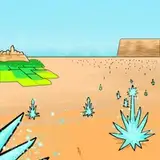
Step two (optional): Remove the sky from in game with the wand tool. If you want to use the sky from SSO, you can skip step 2, 3 and 4.

Step three (optional): Draw the sky as you like, underneath the screenshot layer.
I'm a sucker for a colorful sky, so you often see sunsets and sunrises in my instagram feed. Here in this particular sky I have only used colors from the free winter palette I have on my Gumroad. I used my shading brush which you all have been provided with. First with 100% opacity to create the base, and then on 50% opacity to blend the transitions.

Step four (optional): Add some clouds if you'd like. Here I have used my cloud brushes from my landscape brushpack. I blurred the cloud a bit afterwards with the gaussian blur filter.

Step five: Play around with colors and hues (to make it match the new sky). Here I have done very small, but necessary adjustments. I have turned down the exposure/brightness, turned up the contrast, turned down the color vibrance, turned up the clarity and made it a tad warmer. If you care about color schemes and your instagram aesthetic, try to remember/write down what kind of adjustment you make. Or if your programs allow you to, you can save your adjustments as a filter.

Step 6: Add new footing and grass. Personally, in my own style, I'm not fond of the SSO textures, so 90% of the time I draw over it. Here I have used the sand/gravel brush and various grass brushes from my nature brushpack. I always pick up colors from the base picture when doing this. All brushes used in this step was on 80% opacity. As a finishing touch on this step, I added some light shading on the sand layer, to create some depth on the sand/grass transitions.

Step seven: Let there be light! Super important (in my opinion) to create beautiful and realistic features in a background. Use whatever brush you find the most useful, and use a light yellow/orange color on a overlay layer. The brush should be on 50% opacity, and you can just duplicate the layer if you want it brighter. If you're not a fan of a blurred background you can just end it here, but there's a few more things I do personally before I'm done.

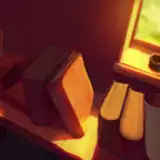
Step eight: time to blur! I always use the field blur, and I also add a tiny bit of grain to it.

Step nine: Add small details such as bokeh, light beams and dust particles. These I create with the same technique as I did with the highlighting; bright yellow/orange color and on a overlay layer, duplicated if necessary.

Step ten: I always wrap it up with doing some more changes to the brightness, color and hues. It sure is satisfying to see that we went from this - to this:

Hope this little tutorial helped! Feel free to ask anything if there's something that's not explained well enough! And general feedback is always much appreciated 😇
I've included the finished background, feel free to download it and use it if you want to. And don't be afraid of making changes to it if you'd like! No need to ask for permission 🥰
Hope you're having a good week so far! Later this week I'll I have a small surprise ready for you!
Hugs from Cath ❤️