Hey everyone!
Today I tried out my new handmade watercolors from PoemsAboutYou. I recorded the painting process for a review on my Youtube channel, but I wanted to talk you through the painting step by step!

First off, I did a couple swatches mixing various colors and seeing how everything bleeds, lifts, mixes, and granulates. I did some research on the individual colors that I purchased, seeing which ones granulate and are transparent, so I tried to be mindful with how many colors I mixed and preserving luminosity.

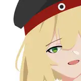
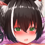
I used a Prismacolor Col-Erase pencil in Terra Cotta to sketch out the figure on Arches hot press paper. I don't love hot press paper, and I knew this was going to be a little bit of a challenge for me, but I wanted to use a higher quality paper because I wanted to take my time, and I knew I might have to lift the paints since I've never used them before.

I taped off the paper with washi tape to mask the paper off and make sure I have a crisp edge at the end of the painting.

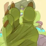
I began blocking in rough colors and shapes, and I already began struggling with the paper. I haaaattte hot press paper :( The beginning stages of the watercolor process look so ugly, and it takes a lot of patience and vision to see what the end result will look like despite all the ugly bits.

Adding more colors, the paints are bleeding weirdly into the paper. This is the reason I don't like this paper, buuuut I know I'm in the minority. Hot press paper is just not forgiving. These paints lift well. I don't use a lot of lifting in my paintings if I can help it, so it's a little bit frustrating when colors lift too much on me (as you can see is happening with the cheek).

I started using the Genuine Mayan Green for the background, and this color is incredible. I love this dark deep green, and I love the contrast between that and the bright orange tones in the face.

I painted the rest of the background with Indigo; also what a showstopping color!! I 100% recommend both of these colors. They're so rich and pigmented, and they dry with the same vibrancy. I used a mix of my Trekell brushes with the Beste brushes I've been loving recently.

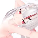
I started to add some warm shadow tones and deepening the values. Adding some of the Azurite around the eyes and earrings.

I added some of the Geniune Mayan Green to the leafy bits in her hair and around her eyes. I usually start to add darker details way earlier, but these paints definitely need to be layered up, so I patiently took my time added layers to the face.

Lifting more around the eyes, darkening shadows.

Mixed the Tyrian Cobalt Purple to the Indian Red for the deeper tones in the hair, and added that color to the eyebrows and eye shadows.

I continued to deepen the tones in the hair, adding the same color to the shadows on the back and then adding some warmer tones to make sure the skin still looks like it's glowing. I added a second wash to the background to make sure everything looks rich and deep, and detailed around the edges of the face to smooth everything out.

Deepening the background more.

Adding more pinks and oranges and adding some darker tones to the longer strands of hair.

I added some small ink details with my purple Hi-Tec-C pen, and then added highlights with the my Gelly Roll gel pen. This is where the piece really came together, especially with the highlight on the nose!


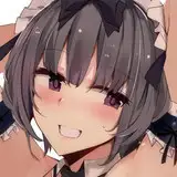
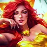
I pulled the washi tape off the paper and this is the final painting!
I really love the final outcome, and these paints are so fun. I 100% recommend them. If you want swatches and names of the colors I have, as well as links, LET ME KNOWWW!
Julia Wasala
2020-04-18 12:33:04 +0000 UTC