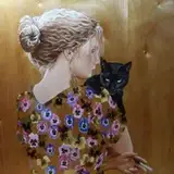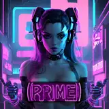
Currently redoing Kate since (if I'm not mistaken) she's my first video that went up last year. Time really flies...
Her right eye (more clear) is what I'm aiming for and I'm correcting her Left eye (blurred one) since I was testing out various colors to see which ones I really liked.
Even her hair I may change since I want her to be blonde but that's a bit too yellow. I hope to get better at drawing hair soon because I prefer hers to barely touch her shoulders but for now she may have it short and I'll update it when time passes.
----
I've been trying to get a better understanding of color theory and how different colors clash, compliment, and really help something stand out.
I struggled with Liaison's look for months trying to not make her colors clash and learned more about tones and hue's.
Crazy how in comics and shows there's many characters with bright and contrasting colors, yet it somehow works. That's the part I'm trying to get better at with the "Why" does it work?
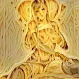
The second image is Kate's color tones. The 6 rows will be filled with different tones for when she's in the sunlight, shadow, etc since she'll be a continuous character.
Let me know your thoughts or if you too have found some things that worked for you.
INVIROSE
2022-09-24 19:01:42 +0000 UTCironherc
2022-09-24 18:49:35 +0000 UTC