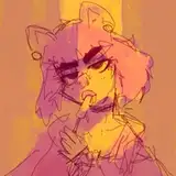
Doing another one of these because it's been a while! This kind of stuff usually just happens in my brain but I thought of writing this stuff down and maybe nail it when making conscious decisions when dealing with pushing shapes/proportions.
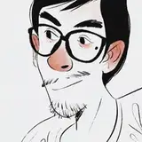
Anyhow, I'm a fan of Nathan's work and how they incorporate shape and texture into making appealing designs. I'm always wanting to push the proportions in my work and I'm trying to figure out how Nathan does it!
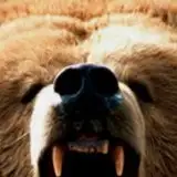
A lot of their work uses a bunch of big shapes but is complemented well with a smart use of medium to small shapes. There's a LOT of space between forms but Nathan fills it with well placed textures/lighting/details.
There's not much 3D going on here as the style is already on the way to graphic design-y. A lot of rules-of-thirds going on in this, too! Hoping to practice more of this drastic contrast in proportions in the stuff I do!