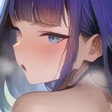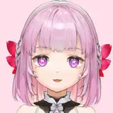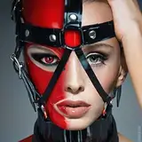
Ingrid is so fucking cool. TBH, this is probably the coolest I have ever drawn her looking.
I started the drawing with an actual sketch, which I do very rarely (usually I just go into inks without any thought at all). I kind of just wanted to see where some of the highlights would end up hitting, and I would then make alterations in the final piece as-needed (as you can see, her legs are very different here from the final; I DID end up making a version with her legs like this, but I realized how wrong it looked last night, and so I woke up this morning and made tons of fixes hahaha).

I am spending a lot more time rendering lately, and making sure I give my art my all. I know that’s not always the most important thing (sometimes flats really just do the trick!), but I have been having so much fun putting time into learning as I work ☺️
For instance, the way I rendered Ingrid’s cute top and her jacket was very different than I have ever done it before; usually, I would work out the black areas in the inks, but I have found that, while for some drawings that’s really worthwhile - especially with flatter images - sometimes it just doesn’t blend well when something is super highly-rendered otherwise (there are ways to make it work, especially with the incredible contrast of vinyl, but it still leaves some of the mid-tone-reflectivity off the drawing).


So in this case, I had fun making the shapes work in the rendering itself. It was honestly tough, but I think it allows for greater variance, and it ends up looking better.
I am also trying to work well at creating more bold lighting scenarios, not just using one key light, but giving the image a very vibrant, rim-light feel from different-color sources, as is evidenced by some of my more recent work, but as is especially noticeable here. Balance was difficult, because you want the colors to contrast enough for the shadows to create deep value, but you also don’t want to lose any detail in the process (by choosing a color less bold). I think I like it here. The green and the yellow, while not SO far apart, are varied enough that you really get a sense of the lighting directionality and differences.

For bonus, here is a black and white version which just shows how the values operate in the piece, which I think looks very cool ☺️

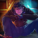
With MJ, I just wasn’t happy with a certain aspects of how I had drawn her (particularly her arm, which was too long and looked angled weird), and so I fixed that and then didn’t stop altering her for like two or three days, ultimately deciding that the original shininess of her dress didn’t aesthetically match the rendering on her skin, and so I made the whole thing read a bit more latex-y. I am mostly very happy with the result 😌😌😌
What do you all think? Do you have any questions about how my process has changed of late? Do you find this interesting? And do you think the difference in results has been worthwhile?
(Side note: you’ll notice that Ingrid has a very prominent bulge here, as was given to her at the end of my comic BLONDIE; this isn’t canon, but also like whatever, I’ll put a dick on any character I want 😌)
Tim Sullivan
2026-01-19 17:05:28 +0000 UTCWilliam McDonald
2026-01-19 15:38:33 +0000 UTC