Smush or no Smush, you decide
Added 2024-07-22 17:53:28 +0000 UTCHey guys, I was rendering the new Paizuri page and I wanted to check with you on the readability of something.
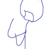
If you've ever looked at anime illustrations, occasionally you'll find an image with a girl pressing her breasts against some glass. It looks something like this.
(had to find one I could attribute to someone)
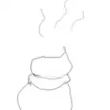
I decided to do something similar with the new Paizuri page, except instead of breasts pressed against glass, it's meant to imply Azula pressing her body against Toph.
 The problem is, I'm not sure if it looks good or if it's readable, so I made an alternate version without the smush. However, in doing so, I had to change the position of some of the anatomy to make it work, and I'm not sure if it's an improvement or not.

I'd like to know your opinion before I continue with this. I'd also like to know your reasoning behind whichever one you pick or if you think one has an element that will work in the other. , but don't feel obligated.
Comments
Damn, smush is the logic choice for this one since Azula is pressed up against Toph. But at the same time the non smush looks really good too. Maybe do both of them to show the movement ?
Benny
2024-07-24 07:36:07 +0000 UTCBoth look good. Maybe add some parts of Azula's body to the pic to help show what's going on?
Graham
2024-07-24 01:04:33 +0000 UTCWhile I like no smush the not visceral but something like that feeling (wish I could think of a better word for it) I get seeing the smush, just does something for me
FDV22
2024-07-22 20:00:47 +0000 UTCSmush looks better imo
MagicCarpetMadeofSteel
2024-07-22 18:42:24 +0000 UTCI don't really have a preference. Both look fine to me.
Malesor
2024-07-22 18:09:01 +0000 UTC