Hello there!, here are some thoughts about my latest practices
Jaguar
This practice reminds me of my old days when I used to draw characters while fighting. They had very aggressive facial expressions and dynamic gestures. Most of those sketches back then were created from imagination, so I was a bit surprised how this reference already looked kind of stylized because of the cat face and the body shape. The challenge was not to push the gesture in the practice but to keep it and simplify it to some extent. The tedious part was recreating the values underwater. The jaguar’s complex fur and the light under the water made it difficult to spot the shape silhouette of the shadows cast by the skin volume, as well as the areas where the light hit. In other words, the rendering was the challenge for me.

The Sea
This, in my opinion, was a bit less complex. I judge complexity in a practice sometimes by looking at the amount of shapes and the range of values. For instance, in this picture what stood out first were the trees in the foreground. Based on their position in the composition, they had darker values, and then in the background I split the sea and the mountain. The mountain had a simple shape silhouette with a few contrasted areas of vegetation, and the sea had no clear silhouette but a very intricate and complex highlight reflection from the sky on the waves. Due to the size of these small shapes with no larger silhouette, I figured that one brush with small, well-defined textured shapes would do the trick. You will see more about this in the video.

Now, I don’t really know how I make these analyses in order to decompose references into a set of steps that I can later build up with strokes, but I assume this is the product of continuous repetition, and after a while it becomes a bit intuitive to figure out how to build from scratch what I see.
Money Jar
The challenge in this picture was to capture the look of the complex text and patterns on the dollar bills. I wasn’t planning to paint them exactly like in the reference, but to come up with a series of strokes that clearly suggested what they were. Maybe it wasn’t that difficult for the viewer to guess, since the dollar is known worldwide, but I think it was a win for me because I forced myself not to add too much detail, and I still liked the result.

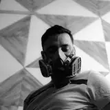
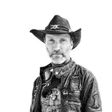
Portrait
As usual, I do at least one portrait every week. What I liked about this one was the light, texture, and colors. It was a good challenge because the scars on the man’s face made the skin surface harder to render quickly. In the shadowed areas, there were two very distinctive tones: one purple and another, even darker version of that shadow. For the lit parts, there was a very bright area and then a slightly darker tone that matched the man’s skin. It’s hard to describe precisely, because in reality there were more subtle tones and transitions than the ones I’m mentioning here. My goal was to simplify all of that, as you’ll see in the video, and then build up new layers on top.

Why is this so important? Because training your eye and your mind to focus on the big shapes and overall impression first creates a base where all the smaller strokes can later add detail and information. I hope this makes sense.
Tomato
I guess I chose this picture because painting just one tomato would be too boring, so my excuse was to paint as many as I could but in this market presentation. I kind of like painting markets and everything inside because I spend a few hours every week there. They have so much life, so many shapes and colors.

Clothespin
Because one way to practice is to pick complex references and simplify them, I wondered if I could do the opposite with this reference. I chose to make the value transitions with different brush textures. I pushed its shape silhouette and perspective a bit more, and finally I used some cooler tones just to make the palette wider. Is there value in making things more complex? I don’t know. I probably do this more often than I realize, every time I add more colors and textures than the reference had. But what I know for sure is that the quicker I can capture the likeness of a reference in my practice, the sooner I can have fun experimenting, so props to that.

Process Video: https://youtu.be/MIsq02eTt_E
Brushes: https://drive.google.com/drive/folders/1wHu8wuEHjDk-VfnZqv8iy8rwnvu8Ngmj?usp=sharing
.
Welcome to all new patrons. Remember you can now pre-order my book Life in Every Sketch on the 3DTotal shop.
https://rebrand.ly/The-Art-of-RamonN90

Please let me know if you have any questions—I’ll be happy to help with art advice or book details.