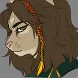
Potential Cover Art for Book One
Added 2025-02-08 10:50:31 +0000 UTCSo I commissioned an artist to make a poster, and after almost completely ignoring everything I said and failing to send me sketches before committing to the finished work, she sent me this.
Suffice to say, I am unhappy with the end result, but unfortunately, I have paid and she does not do the refunding.
Ergo, here I am. If you guys say you like this, then I'll use it. If you don't, I'll commission another artist.
PS: I added the title myself, because according to her she's an artist not a graphic designer, and that's for graphic designers.
Guess I'm a graphic designer now 😂


So, which do you guys prefer? Green, red, neither? Tell me in the comments.
Comments
Agreed. Sucks that it happened to you, Jackpot, and yeah, it's bad art--and arguably not art at all. Worth commissioning a new one if you plan on publishing--and reporting this designer regardless.
Grand Odyssey
2025-04-02 21:58:13 +0000 UTCI think he's dead
Scipio
2025-03-11 18:43:21 +0000 UTCany release inc soon?
Duy
2025-03-04 00:22:53 +0000 UTCIf this isn't free-tier AI generated art that someone blended and stenciled over then I didn't know what is. Structural lines in the building are mismatched, the hands aren't hands, the faces are busted. Low-cost/free image gen can't do text, so that may be why they refuse to put in words. You got scammed...
Sean Wilner
2025-02-15 19:48:23 +0000 UTCJade skin and brows like swords 😂
Rumble Cloud
2025-02-10 18:54:29 +0000 UTCMan it looks like drew out a picture of a real person and squiggled a mustache on
Rumble Cloud
2025-02-10 18:50:07 +0000 UTCWorst cover-art ever. Sorry 😞! Not sure who looks worst in the ugly contest between Meng Yi and YM Xian. IMO You are better of using your patreon jackpot logo as cover-art.
Mike
2025-02-09 17:24:21 +0000 UTCThe copywrite office just released a statement that as long as any part of the art is original, it's still able to be copywrite. I would change one small thing and submit it anyways. It doesn't have that obvious AI look like some.
Joseph Blake
2025-02-09 13:18:24 +0000 UTCAmazon doesn't accept AI art is the problem.
George Tasie
2025-02-09 06:29:25 +0000 UTCI told her that. High cheekbones, with that noble, solid look. She gave me this.
George Tasie
2025-02-09 06:28:58 +0000 UTCI would have used that from the start, to be honest, but Amazon doesn't allow AI generated images on covers for some reason.
George Tasie
2025-02-09 06:26:58 +0000 UTCYeah, I'm afraid you've been scammed - better off with either the Royalroad or the Fiction.live cover.
Hokagine
2025-02-09 03:17:22 +0000 UTCA solid black background with plain white text as the book title would be better than this.
Zaim İpek
2025-02-08 22:24:11 +0000 UTCgraphic design is not her pashun :(
Hunter Brown
2025-02-08 19:24:41 +0000 UTCThis is great advice/inspiration.
Whalehunter
2025-02-08 19:06:47 +0000 UTCIf she’s an artist so am I lmao, maybe ask some authors on RR who’ve published and seemed to have found decent artists
Extra16
2025-02-08 19:01:46 +0000 UTCalways check hands with ai. and the young masters are completely fucked. and the girls look almost right. so yeah anything else honestly. red makes more sense with the sun motif as someone else mentioned
Lazerus56
2025-02-08 18:50:16 +0000 UTCNope. Just nope.
Fitzgibbon
2025-02-08 17:52:03 +0000 UTCHoly shit that is bad! 😂
marconjecture
2025-02-08 17:33:14 +0000 UTCI prefer the cover on RR :( As for the title, red looks better. The textured letters should probably be brighter for readability
Christopher Hillenbrand
2025-02-08 16:51:10 +0000 UTCAtrocious mustache. They did my guy dirty. He looks like hes a teenager, i expected MC to have more pronounced features with high cheekbones. This one just looks like a boytoy for someone who likes em young or directed at a younger audiance, not even a gigolo or a handsome man.
Rumble Cloud
2025-02-08 16:09:51 +0000 UTCThis cover would make people pass on the book. The RR cover is better if you don't want to pay for it again.
Joseph Blake
2025-02-08 15:33:17 +0000 UTCSo this is pretty clearly some bad AI art. Or an artist that is so bad their work looks like an AI did it. You got scammed. Hopefully you have better luck with a different artist.
Zaim İpek
2025-02-08 13:58:39 +0000 UTCYeah… If you used a credit card or paypal, file for a chargeback. If you have records of sending this “artist” ideas of what you wanted and can show how much this is *not* that, you’ll get your money back.
Andrew R.
2025-02-08 13:09:08 +0000 UTCThe cover picture from royal road is 10x better than this
Oskar Nordström
2025-02-08 13:01:43 +0000 UTCOof that’s rough.
Azena
2025-02-08 13:01:34 +0000 UTCthe fact that they just drew it and didn't give you any kind of feedback sketches or design input makes me think you got scammed badly... I hope you didn't spend too much. yanno, when Miles English is getting a cover made, he usually has 4 rough draft sketches drawn up that he can choose elements from... that also gives him the option of more dynamic covers. We don't always like elements of those covers, but they *do* look professional. If you don't want to get burned again, what I suggest is: The picture and the font are too busy together. I would give it a solid cover with maybe a stylized sun on the cover. You're already having to do your own font so you might as well. Then book two can have a stylized web or a stylized tiger ect. If you *do* want to take the plunge again, I'd find a royalroad amazon book you really like the cover of, and contact that author to get the artist details. you can shop around without buying anything, ask for quotes for a cover from each artist and don't let them just draw something with their hand out and call it good, like this person seemed to.
MagicWafflez
2025-02-08 12:49:12 +0000 UTCThis is atrocious. Do not use this as your cover.
SquiddlyWinks
2025-02-08 12:46:46 +0000 UTCYeah, no, that's not good. Honestly, it kinda looks AI...
Daniel
2025-02-08 11:35:40 +0000 UTCIn my honest opinion, If I was to see this on the front cover of a book, I would subconciously pass on reading it. I still find myself doing this sometimes. Sorry
PirouettePrisoner
2025-02-08 11:02:02 +0000 UTCStock image of a sunrise over a Chinese village/town? Then ceremonially burn that image
Robert Holderness
2025-02-08 10:57:26 +0000 UTC