While I didn't extensively document this one as I went, I thought I'd post what I have since it's been a while since I put one of these together!
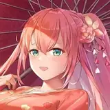
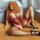
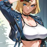
This was an illustration that I made for Procyon Gaming for one of their play mats.
If you have questions along the way (about brushes, my coloring methods, etc), you might be able to find answers by clicking through the drawing guide masterpost. If you still aren't sure about something, though, feel free to leave a comment at the end!
1) Thumbnails! I honestly cannot remember the last time I had to work with a horizontal canvas, so this one was super tricky for me lol... The first thumbnail was a suggestion by the company, the second was a low angle to accentuate the feeling of the character being a powerful entity, and the third is a more standard "show off the character" sort of image.
2) In the end, we decided that the third, while simple, was the most effective for this specific kind of merchandise.
3) From there, I got to work on a cleaner sketch - to do this, I lowered the opacity of the thumbnail and sketched directly over it on a new layer just to keep things more or less in place. I wound up implementing a few changes: her expression became a bit softer, the hand holding the staff became looser, and the hand holding the shield is reaching out to the viewer. In general, it became a more inviting image.
4) I got to work on lineart (in Sai, as always). I wound up following the sketch pretty closely, but I did change the shield hand a bit - this hand gave me so much trouble!! It's kind of a hard angle to pull off well. In the end I took a picture of my own hand as reference and then struggled with that hahah
5) Flats! As usual, I switch to Clip Studio from this point onward. I wanted this image to be bright and airy, so no dramatic lighting or limited color schemes. It's fairly straightforward. Since the main colors on the character are red and yellow, I figured I might as well go for a classic RGB color scheme - the red ended up popping really well against a blue/green background! The sky also keeps the image feeling light. I didn't want the background to bog things down or take attention away from the character.
You can also see where I started trying out ways to handle the pink trim details, but I ended up going a different route.
6) Kind of a big jump, huh...!? This is the completed image after I color the lines and render the colors. I wanted to keep this one soft, so I did a lot of airbrushing and gradients while keeping hard shadows to a minimum.
I focused on trying to make the image "glow," so I added a lot of highlights to the edges and colored the lines a bright reddish orange to give the impression of light. I also used warmer tones for the shadows - you'll see a lot of pinks and purples. I didn't want to use super cool tones that would contrast the rest of the image since dramatic lighting wasn't the goal here!
7) Here's a better look at the colored lines!
8-10) And here are some closeups to give a better look at the details!