Fabula Ultima: The Eight Pillars
Added 2018-07-30 12:00:01 +0000 UTC
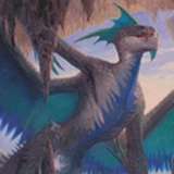
Hello! First of all, here's the new (and likely final, but let's not be too hasty) logo for Fabula Ultima. It's dreamy, and green-blue, and JRPGish... and I'm pretty happy with it, but I'd really love to hear your thoughts.
However, the meat of this post is... the Eight Pillars! What's that about? Gimme a sec!
Basically, the world in which your Fabula Ultima adventures will take place is not predetermined: its cities, regions, realms, deities and cultures are something your group will create (the shared World Creation is a core part of the creation process, alongside Group Creation and Character Creation). As you explore and travel across this fantasy land you will have plenty of occasions to add details and unravel its mysteries!
That said, all Fabula Ultima worlds share the following eight fundamental elements, known as Pillars.
- ANCIENT RUINS AND SAVAGE LANDS
The world is an ancient and wild place: cities and villages are separated by vast plains, scorching deserts, frozen peaks and impenetrable forests. The land is dotted with crumbling fortresses and shrines devoted to deities whose names have been lost to time. Past civilizations and ages of darkness have left behind a world of powerful artifacts and cryptic legends, as well as magical (and often dangerous) places.
- A WORLD IN PERIL
Villages, castles and city-states are among the few areas that aren’t literally crawling with monsters, brigands and other hostile or savage creatures. Far more dangerous still are Nemeses, powerful antagonists casting their shadow over the entire land. Mad sorcerers, evil gods seeking incarnation, power-hungry empresses, perhaps even alien entities: there’s a single, unspeakable terror behind the dangers of the world, and our heroes are bound to cross their way, sooner or later.
- THE CLASH OF CULTURES
The world may be in danger, but its inhabitants are still divided by ancient grudges: religious schisms, tales of past crimes and the conflict between magic and science are among the most common causes of enmity. Unless our protagonists intervene, it is unlikely that these cultures will set aside their hostilities and form an alliance.
- EVERYTHING HAS A SOUL
All the matter in the world, including its creatures, the earth, sky, sun and stars are part of a great flow of spiritual energy. The origin, nature and function of this energy may vary depending on the world you create, but its presence is undeniable and anyone able to manipulate it (be it through spells or machinery) is a force to be reckoned with.
- MAGIC AND TECHNOLOGY
In every Fabula Ultima world, science and magic represent two different ways to study and manipulate reality: one does so through matter, the other through the soul inhabiting it. Miraculous machinery might be hidden beneath the ruins of an ancient civilization, and even the most powerful wizards will often employ vehicles and airships.
Many of these worlds also feature an unusual science which combines magic and technology into magitek: metal soldiers animated by the souls of the fallen, bombs unleashing elemental mayhem and flying machines fueled by wind spirits are only a few examples of what can be created by this hybrid craft.

You might be familiar with these guys.
- HEROES OF ALL SIZES AND SHAPES
Fabula Ultima’s protagonists are full-fledged heroes, extraordinary individuals possessing unique abilities and whose actions will shape the fate of the world. While some may not exactly be noble knights or law-enforcing paladins, even the thieves and mercenaries among them are characterized by their will to change and, when things get rough, they can be trusted to do the right thing. In line with the videogame genre we are drawing inspiration from, our heroes do not follow any rule of realism: be they children with incredible magical powers or elderly warriors able to handle an entire army, all that counts is the strength of their spirit.
- EVERYTHING REVOLVES AROUND THE PROTAGONISTS
Anything taking place in Fabula Ultima revolves around our heroes, in one way or another. Dramatic events happen when they are present (or because they are present!), and the great powers (and evils) of the world will pay special attention to them. Following the same logic, the heroes’ determination will allow them to achieve the impossible, such as defeating an empire or sealing away a powerful deity.
- MISTERY, DISCOVERY AND GROWTH
This game is built upon discovery: of ancient mysteries and forgotten powers, yes, but most of all of the very heroes, of their feelings and of what they are willing to sacrifice in order to fight darkness. Fabula Ultima’s protagonists are complex and sometimes tragic figures, and their journey will change them forever.
And there you go, these are the eight pillars of the game, the elements that should never change in order for it to do what it's being designed for. Unsurprisingly, most of these are typical of Final Fantasy and similar franchises - but hey, that's what I'm drawing inspiration from!
As always, thank you for your support - and if you've got questions, curiosities and such, please feel free to write them in the comments :D