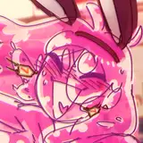
SakeTami
manyeyedhydra
manyeyedhydra

patreon


Hellish Harlot Profiles - Design 2

How does this look?

I thought adding the page of notepaper would indicate it's written by a different person than The Madam's blurb.

I played around with fonts.  Originally, I wanted both to look like handwriting, but every font I tried made the text too hard to read.

Once I'm happy with the template I'll start creating these for all the harlots I have art of.  Might be a nice advertising tool to distribute across the internet (you'll get to see it here first though ;) )

Hellish Harlot Profiles - Design 2

Comments

I think there might already be too much with the Madam's blurbs, and then the Portly Gentleman's notes. After being bogged down on it for the past week, I think I might have to step back and go as simple as possible. I might try it out for some girls to see if it fits, but I'm a bit scared of spending too much time on this when it should just be a bit of text to complement the art.

Many-Eyed Hydra

Minor idea - maybe include a little quote from each harlot at the top?

Zack

The fonts are awkward. I was aiming for it to be a brochure showcasing all of the available harlots, complete with picture and puff-piece by The Madam. Then The Portly Gentleman's handwritten note over the top. I felt The Madam would use an elegant italic font, which meant for contrast The Portly Gentleman's font would be more plain and matter-of-fact. If his is handwriting, it's slightly harder to read. Then making The Madam's even more flowery makes her part really difficult to read. I'm not sure how to resolve that.

Many-Eyed Hydra

It looks a lot better, though it would ideal if the note-paper looked a little more elegant. For the fonts, I'd really suggest switching them round with the more handwriting esque font used for the Madam's intro on the note itself (this is still supposed to be the Portly Gentleman's notes right even if it's not the in game notes).

CrimsonCrown


More Creators