SakeTami
sierralee
sierralee

patreon


September 23 Update

So... I haven't been making as much TLS progress as I've wanted, but I have been making progress. I can't make promises, but I sincerely hope that the next update will be this Friday. In addition to investments and research, it will have the lore I promised, plus a little more combat and exploration than you'd expect from a shorter update. Plus the introduction to the next major phase of the plot, which I hope everyone will enjoy!

There's a lot going on, though, so cross your fingers. I have a bunch of stuff for everyone soon, it's just a matter of releasing it all without rushing things.

Meanwhile, thanks to those providing feedback on the novel. You'll all be hearing more about it in the future, I hope. But for now, I actually have some art for it.

If you're the type of person who prefers to imagine characters themselves, or you don't want any info on The Brightest Shadow (my novel), you can skip the rest of the post. Anyone else, continue on to see some new art and potentially influence the direction of things a bit! It's fine if you haven't read it - it's also nice to know how the art strikes people who don't know anything about the project.

-

This doesn't really benefit me, as the art probably wouldn't be included in a normal novel. But I found it enjoyable personally at a time I really needed a break, so I decided to just go mad with power, since concept art turns out to be surprisingly cheap. Behold as I flaunt dozens of dollars. Dozens! 

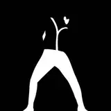
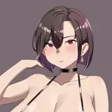
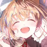
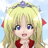
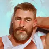
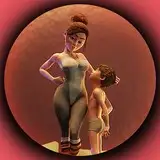
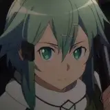
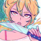
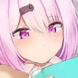
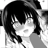
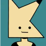
I contacted several concept artists and one of them has a style that I like. Here are two characters drawn in it:

Book-readers, I hope the identity of those characters is clear enough. I don't know that this should be considered 100% official art or anything, though I did give the artists direction beyond the descriptions I gave in the book. I think it makes Tani look too tall - she's one of the shorter characters.

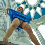
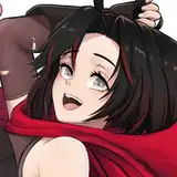
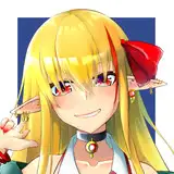
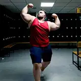
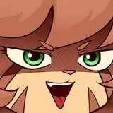
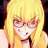
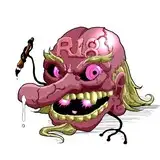
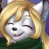
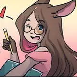
There was also another artist who was pretty decent to work with, but I'm not enthusiastic about certain elements of his style. Here's his Tani:

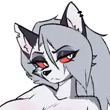
I think I may use the second artist for certain less human characters, like the Catai and Zeitai - he does pretty nice monsters. But all feedback on either is welcome.

I don't know that it makes sense to do much more of this, but I enjoyed the process. Sound off if you like or don't like this kind of thing.

September 23 Update

Comments

Sorry, I don't like turning anybody down, but I got flooded with volunteers. I'd like to get through the initial wave first so I can make corrections and improvements. Thank you for your feedback on the artists meanwhile!

Sierra Lee

Guess I have not been chosen to be a beta reader. Let me expand on my application: I'm a TTRPG master. So I spend quite a lot of time on internet discussing worldbuilding and why a particular setting suck and makes no sense. As well as a physicists if you need someone to tell you how badly is your setting violating laws of physics and how to make them violate those laws even more. So if you need decide to need one more reviewer I'm here. As for the artist: I prefer the first one. The second artist is better at drawing details (face/hands) but they are drawn from a manual and the various body parts are not integrated well together.

snusnumrik

the screen is... ominous

Fulminato

Thinq with her being too tall - since there is nothing standing next to her, we can't know her height. So there must be something that is off to give you (an me) that feeling. I vote for body ratio. The first Tani has Head+Neck = 15,2 %, Body (shoulders to crotch) 38,6 %, legs 46,2 % (crotch to heel of left foot). The second Tani has Head+Neck = 17,4 %, Body 34,8 %, legs 47,8 %. The rule of thumb is that a human is 7,5 heads tall, with Head+Neck being 1,3 heads (17,3%), Body 2,7 heads (36%) and legs 3,5 heads (46,7 %). The second tani has a slightly smaller body and longer legs, making her look somewhat petite, but she is bang on with her head ratio. The first one's head is too small, her body too long which is enhanced as effect by the fact that her upper thigh region almost seemlessly transitions into her lower body. That makes her look lanky and slightly awkward.

I have not begun to consider commissioning any maps, I'm afraid. Illustrations of major events had not occurred to me - I also hadn't reflected that there's a tradition of it. Hmm.

Sierra Lee

Both Tanis have weird looking faces. First just looks too long? To me it looks like her eyes are too far up. However, for some reason even though the second character has the same problem it doesn't bother me as much. I can't explain why the second Tani feels off it just does. First artist has a much cooler style though.

I like the first Tani better, but I agree she looks too tall. Honestly, I'm more interested in seeing maps, cityscapes/landscapes, and still frames of major events such as the Hero's emergence - I think those would fit better with a book like this, similar to Alan Lee's Tolkein illustrations.

Lamsey

Don't you make plenty of yen carrying out assassinations as the mallard with the custom made M-16?

DukeLeto7

So that's were my dozens of dollars go. Good to know.

DuckTogo

I like them both, but I think I like the first artist better, shading is a plus.

Darthjake

Liking the look of the art but the second Tani just feels to me better while the first has a nice stylish effect that touches my art side.

Bladestorm

Magic shadow tentacles just coiling around each other, and around the blond girl in the middle.

Decanter

Well... I would say if SL gets to GRRM (or DukeLeto7) levels of procrastination, it's possible that some of us will no longer be patient with her. That seems unlikely...

DukeLeto7

Oh god. We're getting a threesome with Simon and two different versions of Wendis aren't we?

Taium

With luck, I'll only be toying with them for a few more days! My primary issue with the second version is the face. While I would never say it's poorly drawn, I do not like it. I have difficulty verbalizing the exact reason why (perhaps an uncanny valley effect with the level of abstraction?) but I really dislike looking at it. I'd have requested some changes to details of her outfit and weapons, but the face is honestly the main thing. (On the other side, the first artist's heavy shading just strikes me as really stylish.)

Sierra Lee

OK, that TLS screenshot ..... We all want to believe that Wendis is really going to come back, and that screenie is so ominous it would give Admiral Ackbar apoplexy. Egads. The writer, she toys with our emotions..... I think the first Tani is a better-executed drawing, but I think the second one looks more attractive (and more feminine) which could be part of why a lot of people lean toward it. I haven't read TBS yet (in middle of the rather-lengthy Sharpe series that I don't want to interrupt) but I'm always interested in art that is written after the book, and how the characters fit into the writer's vision. Can you give us some specifics about why you might prefer the first one? What points of the second artists style are you unenthused about? I feel like understanding that might help me "get" you vision of the character (once I finally read the book and meet her).

Dubsington

It makes me think Wendis has a split personality or something. I don't why Wendis would say "Hello again."

NomiNomi

"Thank you for coming alone." Well that's not suspicious at all. I'm not so sure an eldritch entity from the demon realm is entirely trustworthy, but who am I to question Simon, eh?

Handsome Stalin

While I hope for everyone to read it, I think I have as many first wave readers as I can handle. Thanks for your interest, though! Anyway, it's interesting that people have consistently liked or preferred the second style's face. This is why I showed them both, though, because my taste doesn't always match others.

Sierra Lee

Oh wow, this book sounds neat! Are you still looking for folks to read it, or is that no longer a thing? Either way, I'd say I like the outfits, silhouettes, and shading of the first style better, but the second style has the edge when it comes to faces.

smurf

Haha, yeah, I didn't realize the acronyms were so similar until after I'd settled on that title for a while.

Sierra Lee

Thanks for the feedback! I included both because indeed, people have different reactions.

Sierra Lee

Both look good to me.

SantaTheHutt

TBS... The Best Sovereign? :)

Scol

Take you're time we will always be patient with you so take you're time

austin fagan

As for Tani I would go for second artist… Somehow I dont like the way the first artist draw her face... which is kinda strange how his second character looks like (cool). Obviously everyone have their own preferences… I like second artist more but still first is good atleast for second art...

Nefratum


More Creators