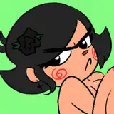
Speed drawing - My greyscale and coloring process
Added 2023-02-27 14:00:03 +0000 UTCHello and happy Monday!
Today I'm going to share a speed drawing, and more precisely my greyscale shading and coloring process.
This won't be much of a tutorial however, but i will write a few key points and short explanations:
🤎 I only use three shades during my shading proces - A main grey for the base, a darker for shadows and a lighter for highlights.
🤎 You might think my ref looks a bit wonky, and very true it does haha! The way I do is that i cut together parts from different pictures (or only uses one picture but changes the position of the body parts) to create my own ref that i'm going for. For me is that way easier to visualize and see where to go with my own end result.
🤎 I always use a clipping mask to my base layer(s). Shading, highlight, coloring - you name it! A clipping mask to the base layer so nothing will go outside of my base.
🤎 I shade the same way as i would with colors.
🤎 The way I color my grayscale is that I first pick the base color i'm going for and fill my horse. I pick and choose between the different layer modes to see which one will work the best.
Overlay, Soft light and Color usually are the best options to get lighter and middle light colors and Multiply and Linear Burn to get darker shades. Overlay, Soft light and Multiply are layer modes you can find in many program/apps.
You might however have to change the opacity and fill of the layer and maybe even but an off white-ish color layer under your main horse color layer to brighten it up a bit if you use Multiply and Linear Burn. Put that layer then to soft light. You basically have to try what works the best in your program/app.
🤎 I also use a lot of adjustments layers to tweak the shade, colors and light. I do not think procreate have that option, but if you are using photoshop then i highlight recommend it! You can find them under Layers - New Adjustment Layer.
There are a bunch of different options and a lot to go through (can maybe talk about those another day?), but use Levels for making things brighter and darker, Color Balance, Selective Color and Hue/Saturation to change the shade of your color, and Hue/Saturation, Vibrance and Black and White for the intensity of the color.
🤎 Last. I use a Black and White adjustment layer and put the layer mode to screen to make my white markings. Drag up the reds and yellows to make them whiter.
I hope the video or the key points and short explanations could help you somewhat!