ご支援ありがとうございます。
最近寒くなってきましたが体調はいかがでしょうか?
本日は期間限定で体温を上げるアイテムを公開します。
Thank you for your support.
It has been getting colder recently, how are you feeling?
Today, for a limited time only, we will be releasing items to raise your body temperature.
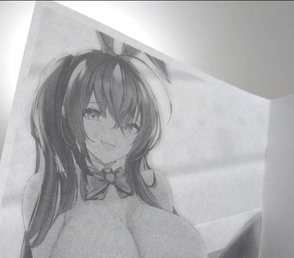
私の同人誌はスキャンされて電子化と無断転載されています。
ここで合法的に閲覧と入手をしてください。
ネットへの二次配布や二次公開はお控えください。
My doujinshi has been scanned and digitized and reprinted without permission.
Please view and obtain them legally here.
Please refrain from secondary distribution or secondary publication on the Internet.
Thank you.
2023-10-22 00:30:38 +0000 UTC
View Post
みなさま、お久しぶりです。
本記事のトピックは以下の通りです。
◆【JP】
◆1.支援解除のお願い(For Supporter)
◆2.充電期間がほしい。(For All Flower)
◆【EN】
◆1.Request for release of support (For Supporter)
◆2.I would like to have time for re-education. (For All Flower)
◆1.支援解除のお願い(For Supporter)
支援者の皆さま毎月のご支援ありがとうございます。
そして期待に応えられず申し訳ありません。
理由は本業が忙しくなりイラストに取り組む時間減少により、
毎月満足できるイラストを上げることが難しいからです。
仕事内容だけでなく、生活スタイルもがらりと変わりました。
その成果イラスト作成に対する取り組み方も、あふれ出る創作欲を共有する活動から、
日頃の精神的疲労を養生する活動に変わったと感じています。
おそらく2024年3月までは現状の生活となると考えていますので、
有料記事がたまったタイミングで一気に見ることをお勧めします。
◆2.充電期間がほしい。(For All Flower)
レベルアップするため時間がほしいと考えています。
昨今のSNSでは現役イラストレータによる講座の充実、AIイラストの登場などで
「女の子キャラ1人のカラーイラスト」「毎週1枚以上投稿」が当たり前になってきています。
他絵師と差別化するためには
早さ、安定性、叡智(Ecchi)に加えて、
「さのしょー独自の強み」を作っていきたいです。
投稿が少なくなりますが、途中経過を楽しんでいただければ幸いです。
以上です。
◆1.Request for release of support (For Supporter)
The reason is that I have been busy with my day job and have less time to work on my illustrations,
It is difficult for me to produce satisfactory illustrations every month because I have less time to work on my illustrations.
Not only the content of my work but also my lifestyle has changed drastically.
As a result, my approach to illustration has changed from an activity to sharing my overflowing desire for creativity,
I feel that my approach to illustration has changed from an activity to share my overflowing desire for creativity to an activity to cure my daily mental fatigue.
I think that I will probably continue with my current lifestyle until March 2024,
We recommend that you look at all the paid articles at once when they have accumulated.
◆2.I would like to have time for re-education. (For All Flower)
I would like to have time to improve my skills.
We would like to have more time to improve our skills.
It has become a common practice on social networking sites to post at least one color illustration of a girl character every week.
In order to differentiate yourself from other illustrators
In addition to speed, stability, and wisdom (Ecchi),
I would like to create "Sasosho's unique strength" in addition to speed, stability, and wisdom (Ecchi).
I hope you will enjoy the progress of my work.
Thanks
2023-10-09 02:33:20 +0000 UTC
View Post
ラクガキ用です
むちむち×ショートヘア×母性をテーマにしました。
2023-08-17 15:42:31 +0000 UTC
View Post
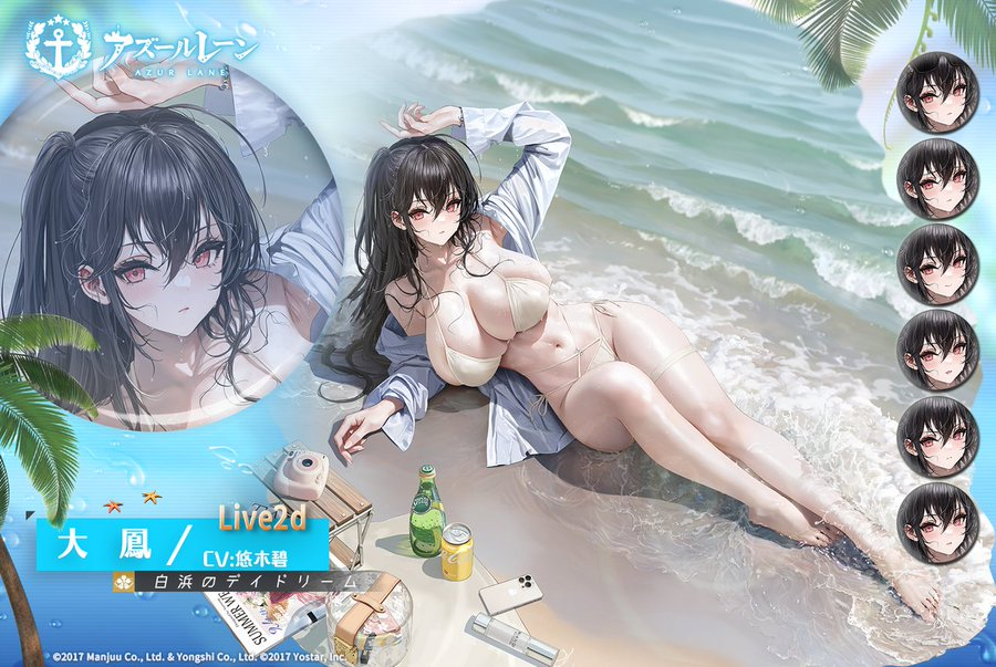
フリーペーパーはヒンデンブルク、ミニ色紙は水着大鳳をかきました。
支援者の皆さまとコミケの喜びを分かち合えればいいなと思います。
The free paper drew Hindenburg, and the mini colored paper drew Taiho in a swimsuit.
I would appreciate it if you could share the fun of Comiket with your supporters.
2023-08-11 10:00:00 +0000 UTC
View Post
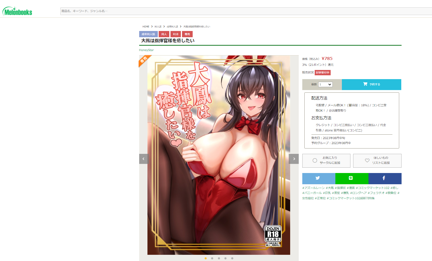
自分の本が通販サイトに掲載されると嬉しいですね・・・!
I am happy when my book is listed on a mail order site...!
「増刷納品したから欲しい人に届けられる…!」と思っていましたが、
嬉しいことに既に20%が注文済となっています!!Σ(・□・;)Really??
I had thought that I could deliver the book to the people who wanted it since I had delivered an additional print run.
But to my delight, 20% of the orders have already been placed!!
現地に来れない方は、ぜひ🍈で注文ですよ!
If you can't come to C102, please order from Mellon Books!
https://www.melonbooks.co.jp/detail/detail.php?product_id=2019028
2023-07-25 11:03:05 +0000 UTC
View Post
ようやく原稿から解放されました。
皆様のご声援のおかげです。ありがとうございます。
現在、メロンブックス様の方で通販準備をしています。
会場にはどうしても…という方は通販の方をご利用いただけたら幸いです。
Pixivの方で公開していますが、追加サンプルを掲載したいと思います。
あとは、無事故で無事に会場入りして、手修正作業の必要が無いことを願います。
皆様お待ちしております。(*- -)(*_ _)ペコリ
2023-07-22 09:52:50 +0000 UTC
View Post
ようやく完成しました…
あとは入稿データを出力だけです。
Finally completed...
All that remains is to output the draft data.
コチラは1ページ目の脱衣差分
コンビニ印刷ですがいい感じ♪
This is the undressing difference on the first page.
It's printed at a convenience store, but it's nice ♪
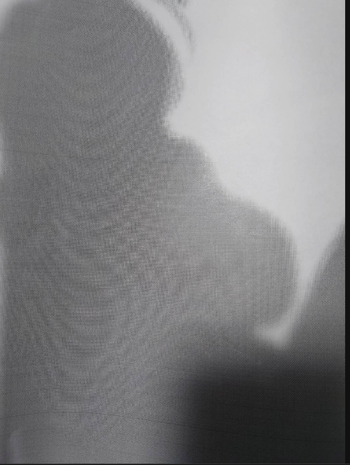
裏のページ(2ページ目)はシルエットですが…
The back page (page 2) is a silhouette...
光で透かすと、逆光表現になり別の見え方ができます。
紙媒体だからこそできる遊びですね。
…but when the light shines through it, it becomes a backlit expression and can be seen in a different way.
This is a play that is possible only with paper media.
金曜日には入稿して、土日には追加サンプルを公開予定です。
既に序盤2ページはPixivに公開済みなので、まだ見てない方はご覧ください。
We will be submitting the manuscript on Friday and will release additional samples on Saturday and Sunday.
The first two pages have already been published on Pixiv, so if you haven't seen them yet, please take a look!
2023-07-20 17:39:11 +0000 UTC
View Post
いつもご支援ありがとうございます。
本日は特別に1ページ分公開したいと思います。
Thank you for your continued support.
Today, I would like to share a special page with you.
2023-07-16 17:01:45 +0000 UTC
View Post
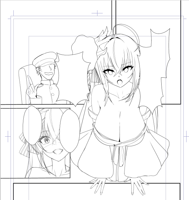
導入です。
アウグスト、ウルリッヒ、山城のコマは後でトーン貼ったりして修正します。
2023-07-11 16:09:17 +0000 UTC
View Post
同人誌掲載予定の表紙差分が描けました
I was able to draw a cover difference for a doujinshi publication
2023-07-10 11:21:37 +0000 UTC
View Post
がんばった所はエナメルの質感です。
The best part is the texture of the enamel.
2023-07-04 10:12:43 +0000 UTC
View Post
まだ最終調整前ですがラフに引き続き支援者限定で先行公開したいと思います。
It is still in the final stages of adjustment, but we would like to make it available to our supporters only in advance.
2023-07-02 06:39:15 +0000 UTC
View Post
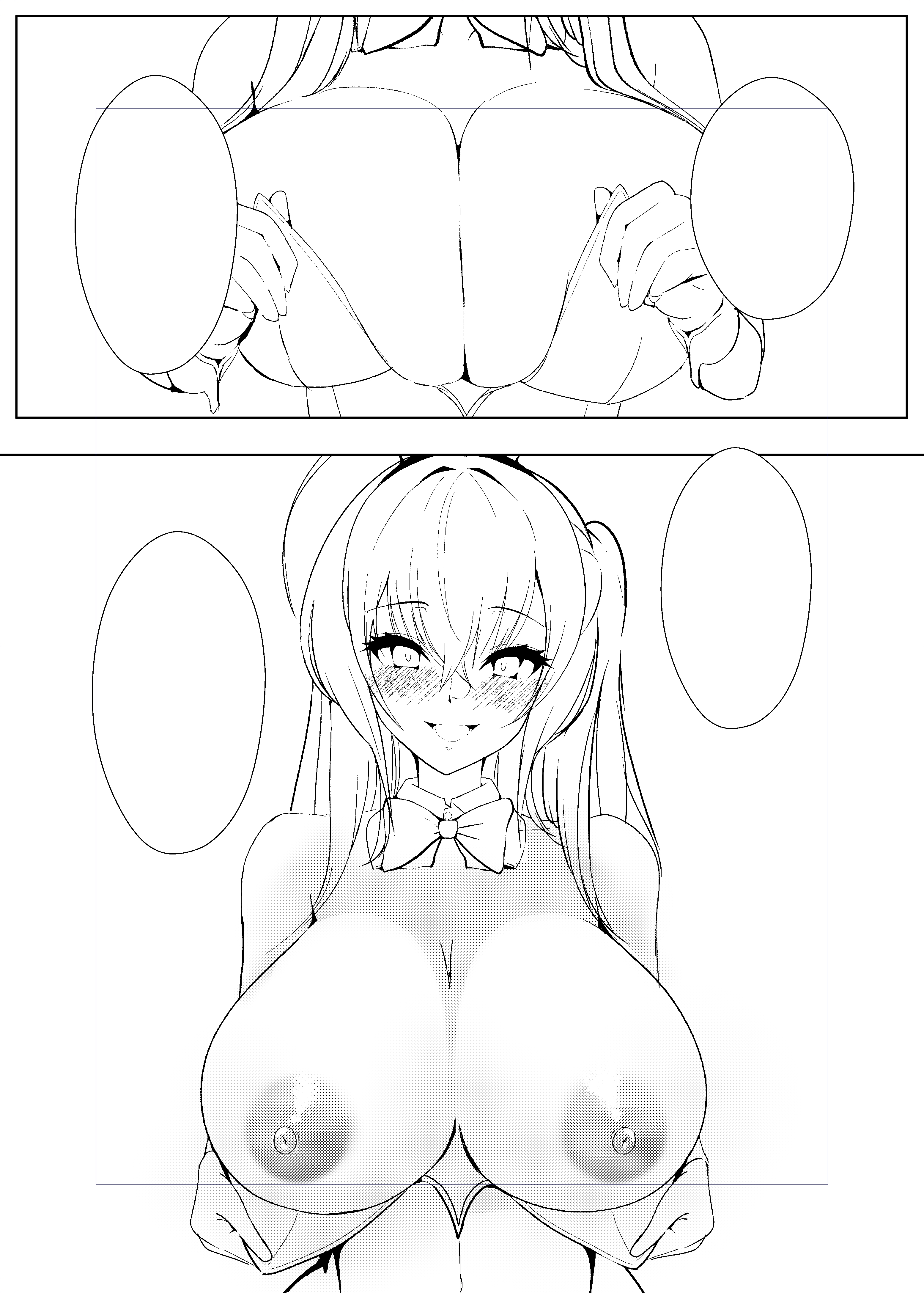
今日は進捗報告を兼ねて1ページ分の線画を公開します
乳首はグラデーショントーン+削りブラシを使って表現していますがどうでしょう?
Today, I'm going to show one page of line drawings as well as a progress report.
How do you think the nipples look with the gradation tone and the shaving brush?
以上です。
Thank you.
2023-06-25 10:17:12 +0000 UTC
View Post
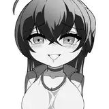
カラーラフまでできました。
個人的な肌ハイライトのトレンドは「楕円枠系」の光源ですね
肌にしっとり感(濡れ感)が現れますし、艶やかさが増している気がします。
この絵はサークルブースの背面に飾るポスターも兼ねていますし、頑張らないといけませんね。
ちょっとサイドポニーのボリュームが多い気がしますので、
清書前に歪みツールをを使って要修正です。
I have completed the color rough.
The my trend for skin highlights is the "oval frame light". It gives a moist and glossy appearance to the skin, adding a sense of radiance.
This artwork will also serve as a poster to be displayed at our circle booth,
so I need to put in extra effort.
I feel like the volume of the side ponytail is a bit too much,
so I'll need to make adjustments using the distort tool before the clean-up stage.
2023-06-21 14:01:58 +0000 UTC
View Post
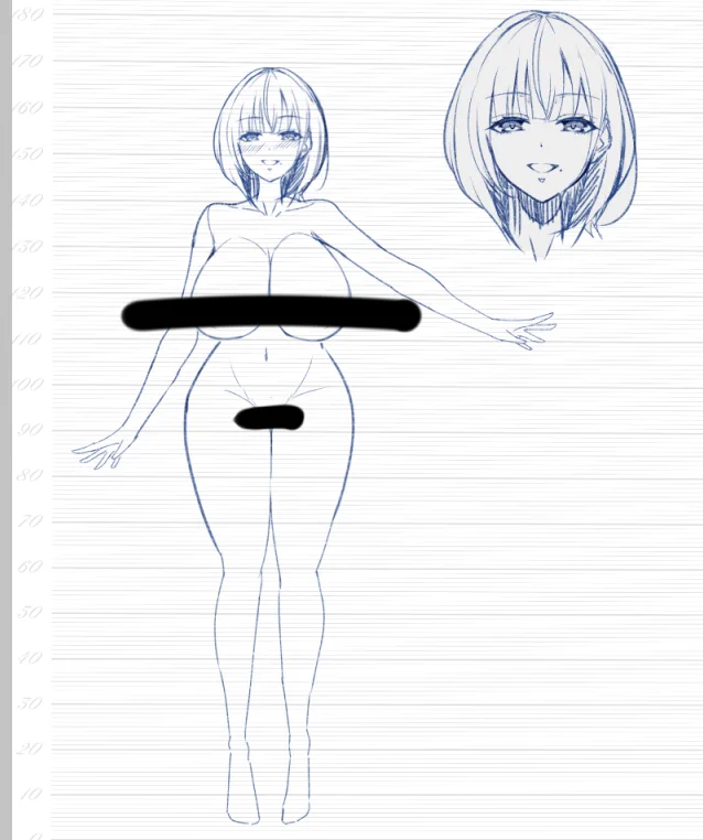
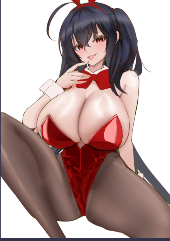
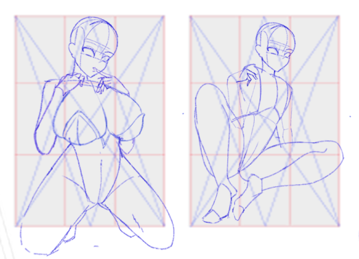
要望として
1.水平~やや下ぐらいからのアングル
→人気ランキングの表紙の傾向から。
2.大鳳らしいポイントを出したい
→でかい胸部装甲
→アホ毛&サイドポニー
3.バニー衣装だと一目でわかって、衣装のフェチズムを出したい
→やわらかい部位食い込む衣装
→腰~鼠径部までの服ラインを見せたい
4.ポスターと表紙の掲載条件を満たす
→トリミングしてポスターにできる
→センシティブポイントは隠す(乳輪はOK)
5.作画コストがかかりそうな部分は削る
インプットを蓄えたり、支援金で購入したポーズ集を参考にして・・・
色々考えましたが・・・こんな感じでどうでしょうか?
バーカウンターの椅子に座って誘惑している雰囲気で描きました(*´▽`*)
(本編にはバーのシーンはありませんが。。。)
2023-06-18 14:56:42 +0000 UTC
View Post
0.見出し
記事の項目は以下の通りです(*- -)(*_ _)ペコリ
★1.当選報告&進捗/Announcement of winning&Progress
★2.支援者、支援予定の方へのお知らせ/Announcement for supporters and those planning to support.
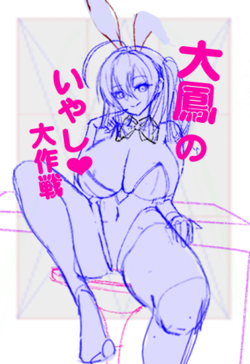
★1.当選報告&進捗
当選通知いただきました!!\('ω')/
土日はバタバタしており事後報告となり申し訳ありません!
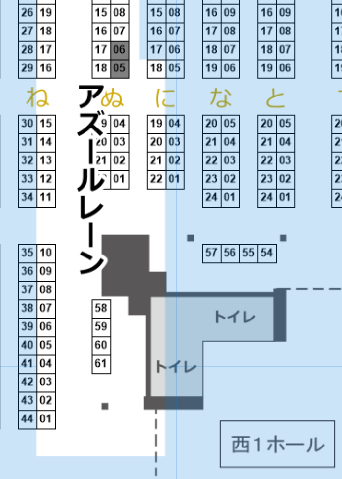
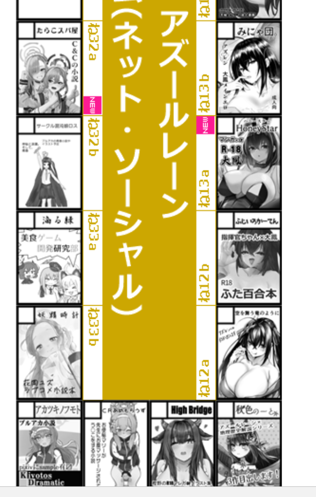
サークル名【HoneyStar】
場所は1日目 西“ね”13a!となります!!!
大鳳島に輝くNEWの文字!!
(背後に迫る過酷なブルアカもすごい…っ!!)
進捗状況/Progress
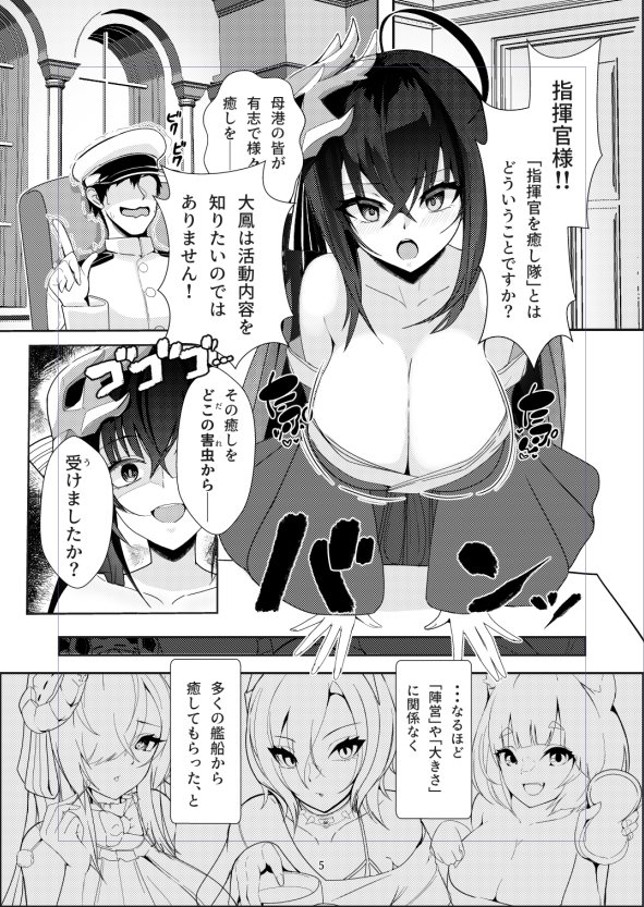
全体のラフは完成、順次ペン入れを開始して7月末までに脱稿を予定しています。
本の内容としては本編18ページで、
【バニー衣装の大鳳が指揮官(男)を無理やr……(咳払い)
……全身を使って癒してくれる素敵な本】です。
完成まで、もうしばらくお待ちください。。。
The rough draft is complete, and I plan to start inking gradually with the goal of finishing by the end of July. The main story will consist of 18 pages,
【A lovely book featuring Taihou in a bunny outfit, taking care of the Commander (male) in various ways... (coughs)… using her whole body to provide healing.】
Please wait a little longer for the final completion.
★2.支援者、支援予定の方へのお知らせ/Announcement for supporters and those planning to support.
コミケ作業のため6月~8月は特別なカラーイラスト投稿が難しいです。
ただ、応援を受けている身として何か恩返しをしたいと考えています。
手段と方法、同人誌が完成したら追ってお知らせします。
Due to my preparations for Comiket, it will be challenging for me to post special color illustrations from June to August.
However,As someone who receives support, I genuinely want to find a way to give back and show my gratitude.
I will inform you of the details and methods once my doujinshi is completed.
Thank you.
2023-06-14 22:40:54 +0000 UTC
View Post
支援者の皆さま、ご支援ありがとうございます。
本日はマンガの進捗を載せたいと思います。
Thank you very much for your support, everyone.
Today, I would like to share the progress of the manga.
大鳳の水着が公開されてとても楽しんでいます。
仕事の都合でラフ状態で止まっていますが、
この場でイメージを共有したいと思います。
I'm really enjoying the Taihou swimsuit design that has been revealed.
Due to work obligations, it's currently in the rough stage, but
I would like to share the concept here.
こんな感じにクリアファイル用としていかがでしょうか?
How about using it for a clear file design like this?
以上です。良き1日を。
That's all for now. Have a nice day.
2023-05-27 13:11:53 +0000 UTC
View Post
使命と受け取りました。描きます。
I felt it as my mission. I will draw it.
[JPN]22:00→01:50時点でのカラーラフです。
さすがに身体が壊れそうなので寝ます。
Here is the colored rough sketch as of 22:00 to 01:50.
I feel like my body is about to break, so I'll go to sleep.
2023-05-19 13:17:45 +0000 UTC
View Post
今日から完成に向けてプロットラフを支援者向けに投稿していきます。
健康に気を付けて初めての同人誌を作成していきたいと思います。
I will start posting Blue Roughs for supporters from today, as I work towards completion. I want to create my first doujinshi while taking care of my health.
コミケ出展経験者曰く
「センシティブなシーンを描いていれば、あとはページの順番を組み合わせて、導入を描けば完成!」と。
According to someone with experience in Comiket, they said,
"If you have sensitive scenes depicted, all you need to do is combine the pages in the right order and draw an introduction, and you'll have a finished work!"
なるほど、と思ったのでセンシティブなシーンから進めていきます。
I see. If you found that advice helpful, then you can proceed with writing from the sensitive scenes onwards.
2023-05-18 14:52:50 +0000 UTC
View Post
次の大鳳です Next Taihou.
たぶんコミケ用の何かに転用しようと思います。
カラーイラストの制作予定として以下の準備に取り掛からないといけないですね。
・表紙用、
・頒布ブースの掲示ポスター、
・クリアファイル
・来場者特典(これには転用できないですね)
もちろん、本編のマンガが最重要事項ですが。。。
I'm probably going to repurpose it for something related to Comiket.
As part of the preparation for creating color illustrations, I need to work on the following:
・Cover
・Booth display posters
・Clear files
Attendee bonuses (which can't be repurposed, of course)
Of course, creating the main manga is the most important task.
・
・
・
・
・
・
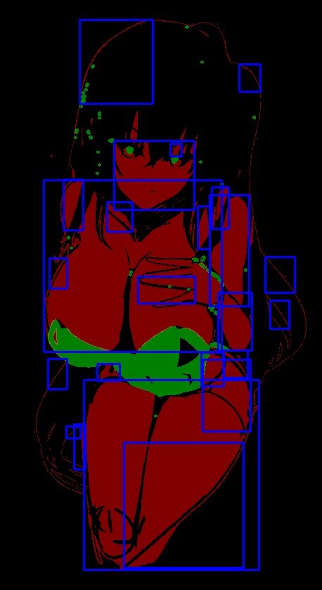
さて、話が変わりますが皆さんは最初どこに注目しましたか?
おそらく胸元の手~左腕のあたりではないでしょうか?(あってますか?)
Well, changing the subject, where do you think most people's gaze was drawn to first? Probably around the chest area to the left arm, right? (Is that correct?)
自己分析用に視線が集まりやすい箇所を青枠でピックアップするツールを自作してみました。自分は美術的な色使いとかテクニックは皆無なので、コレが実用的なツールかは分かりませんがなにかのヒントになればと思っています。
I created a tool that highlights areas of interest with a blue frame for self-analysis of where the eyes tend to focus. I'm not sure if this is a practical tool, but since I lack artistic skills and techniques, I hope it can serve as a hint or inspiration for others.
赤と黒中心なのでホラーテイストですがしょうがない。
青四角が密集している箇所(今回は左腕付近)が視線が集中しやすいのではないかと見立てています。
The color scheme is centered around red and black, so it has a horror vibe to it whether I like it or not. I've picked up on the area where the blue rectangles are densely packed (in this case, near the left arm) as a place where the viewer's gaze is likely to be drawn.
これでイラストに良いフィードバックが得られたらなぁと思います。
I hope to get some good feedback on the illustration with this.
2023-05-14 15:56:20 +0000 UTC
View Post
今回はおふざけ&ジョーク投稿です。真に受けないようにしてください。
This is a joke post for fun and entertainment. Please do not take it seriously.
・
・
・
・
・
・
・
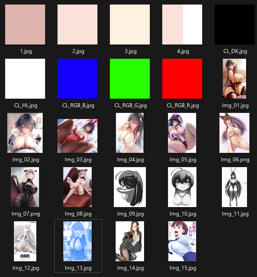
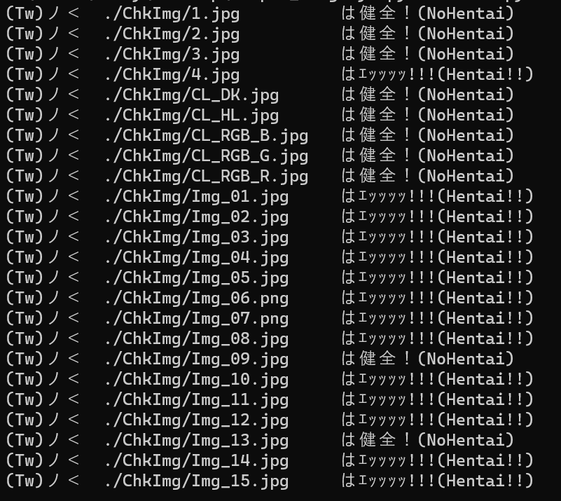
今朝から【Twitterのセンシティブ判定】で話題だったので急遽作ってみました。
1からコーディングするのは疲れるので大まかにChatGPTさんを活用です。
■ということで、使用画像たちと出力結果です
仕組みは超絶シンプルで、エッッッッ!!!と判定する処理と条件は以下の通りです。
1.【画像全体】を分母として【抽出した輪郭範囲(キャラと推定)】が30%以上。
2.【輪郭範囲】を分母として【肌色と判定した範囲】が30%~99%の範囲内。
3.1と2の条件にマッチした画像がスケベ!(タイツやグレースケール対応!)
なので、
・「Img_10」「Img_11」はグレーでも肌色面積が40%超と処理されてアウト。
・「Img_09」は背中を向けているのでセーフ。
・塗りつぶし肌色は「輪郭部分なし」と判定して健全
・逆に肌色が半分しかない「4.jpg」が境界を【輪郭線】と判定してスケベ判定
これくらいガバガバの方がTwitterの判定らしいですよね(笑)
で、興味深かったのは【月曜日のたわわ】で有名な「Img_13」・・・
なんと、肌色検出率が0.00%!
Pythonの画像識別モジュールの判定でこういう結果ということは・・・
この結果はなにかに使えるかもしれない・・・?
これがほんとのAI絵師…ってコト!?
2023-05-13 04:13:01 +0000 UTC
View Post
■早速ですが記事まとめ
( ;∀;)<< やはり画力‥‥!! 画力は全てを解決する‥‥!!
身もふたもないですが以上です。
・画力を伸ばしたい方
・10000❤の方法を知りたい方
・SNSでシャドウバンにならない構図を知りたい方
・「ページ下部に新規のエッッッッ!!!な絵があるんじゃないの?」という方
申し訳ありません。私も知りたいですしエッッッッ!!!な絵はありません。
ここでブラウザバック推奨です。
私の脳内会議を眺めたい方は引き続きゆっくりしていってね🐥
・
・
・
・
・
・
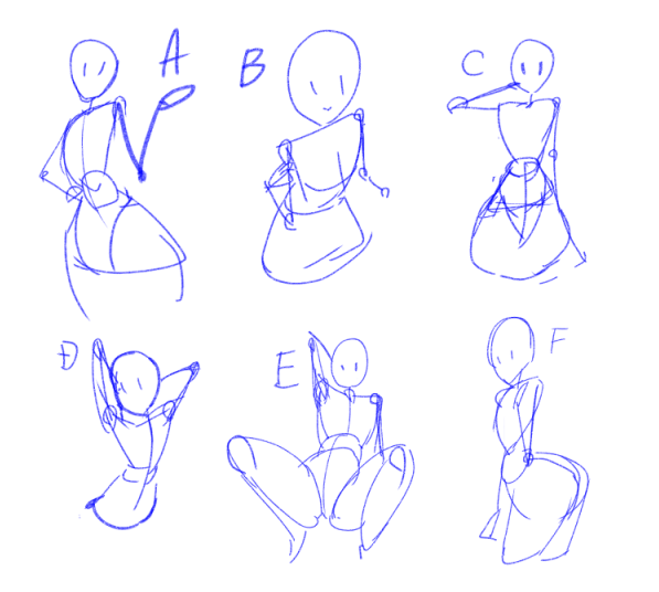
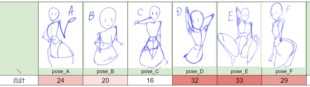
■アンケート回答ありがとうございました!
今回のアンケートの目的ですが、
「キャラポーズの【反応の良さ】を調べたい」という調査でした。
(結果としてフォロワーの性癖調査みたいになってしまいましたが。。。)
■調査方法として…
【ほぼ画力が統一されたラクガキ素体】でどれが人気があるのかを調べ、選ばれた高い順から【6点、5点…2点、1点】という風に点数の重みづけをします。1つだけ選んだ回答には2点を、他回答はすべて1点を付与しています。
※アンケートの回答数が少ないため、調査結果としては適していない可能性がありますが、ご了承ください。
■アンケートからの結論(という名の説)
ということで、アンケートの結果です。
えぇ、見事にセンシティブポーズが多くの支持を得ていました。
「ABCポーズは魅力的ではないんだ!」
「これからDEFポーズを中心に描くよ!」
というわけでは無く、ここから得られる結論(という名の説)は、
【絵描きのフェチズム】と【塗り技術力】が高ければ、
【シンプルなポーズ(※1)】でも魅力的な絵になる(※2)
※1:関節を無視した変なポーズや極端に変な構図でないこと。
※2:自分の実力の範囲内で魅力的という意味。
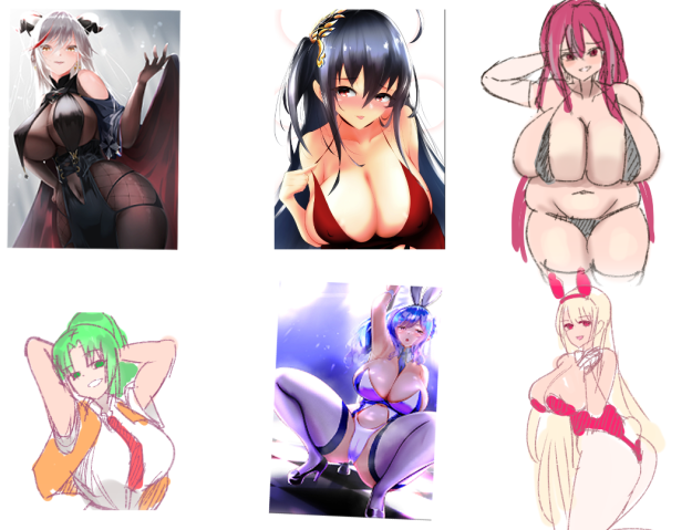
A~Fの元となったイラストはこちら。
※他作者様のイラスト転載できないので私の模写ラフ画でご想像ください。
ABC
DEF のポーズ順です
Cポーズでもフェチズムと技術力を詰め込めば目を奪われるほど魅力的ですし、DやFポーズは当然キャラの魅力を最大限に引き出していると感じます。
一方、Bポーズで描いた大鳳やEポーズで描かれたセントルイスは、当時の画力の限界により元キャラの良さを引き出せなかったと感じます。
青線のラクガキ素体ではなく、元絵でどれが良いかをアンケートするなら
【CDF >>> ABF】 (アルファベット昇順)になるでしょう。
ただ、画力や技術力問わず、以下のように思います。
・ポーズラフ段階で【シルエット】がわかるもの。
→メガネを外して極限ぼかし状態でもエッッッッ!!!に見えるべき!
・ポーズや構図の魅力を引き出し、視線を集める役割としてカラー(肌色)がある。
→エッッッッ!!!なポーズ×カラーで爆発的な魅力!!
・Eポーズはエッッッッ!!!なポーズである。
■最後に
表紙やポスター用イラストの方向性が思いついてきたのでアウトプットに活かしていきたいですね。
2023-05-11 09:00:00 +0000 UTC
View Post
自分の塗り方を振り返りたかったのでFANBOXに投稿します。
I wanted to review my coloring technique, so I will post it on FANBOX.
2023-05-06 05:31:42 +0000 UTC
View Post
左からTwitterにあげた初期案、太もも増量+脱ぎ差分、太もも増量版となっています。
ポニーテールにしてみたらニュージャージーに似ている雰囲気が出てきた。やはりレースクィーン衣装の髪型が大鳳らしいのかな?
From left to right: "initial proposal I gave on Twitter", "increased thighs + undressed difference", and "increased thighs version".
I put it in a ponytail and it has a New Jersey-like vibe. I still wonder if the hairstyle of the Race Queen costume is typical of Taihou?
2023-05-05 08:47:23 +0000 UTC
View Post
SNSの流れに乗ろうと思いましたが成すべきこと(同人誌作成)を考えてお蔵入りとさせてください。
I was going to follow the trends of Twitter and Pixiv, but I thought about what I should do (make a doujinshi) and decided to keep it.
2023-04-30 02:09:16 +0000 UTC
View Post
バニースーツなし差分🐰
Here is the difference without the bunny suit.
なかなか凝ったデザインのスーツでした!
It was quite an elaborately designed suit!
2023-04-26 16:27:47 +0000 UTC
View Post
本日4月7日は大鳳の進水日!!
【+ラフ】
2023-04-07 12:11:30 +0000 UTC
View Post
■はじめに
支援者の皆さま、ご覧いただきありがとうございます。
Thank you for your continued support, dear supporters.
※The English translation is at the bottom of the page.
忘れないうちに、自分の学習用に振り返りたいと思います。
今回の手順はこんな感じです。
1.プロット作成(グーグルスプレッドシート)
2.プロットラフ(青ラフ)
3.赤ラフ(2の青ラフを整える)
4.線画
5.トーン塗り
6.黒ベタ塗り→白ハイライト入れ
7.台詞入れ
以上となります。
同じ作業サーバーで活動しているマンガに慣れた人は、赤ラフを飛ばして線画をするので凄いです。。。
■試行錯誤した箇所
今回は「市販のマンガのような感じ」に挑戦しました。
前回のグレースケールじゃなくてトーンで色表現をがんばるぞ!と意気込みましたが、
clipstudioでは「レイヤープロパティー」から設定できてとても楽でした。
グレースケールで塗る → トーンの「パターン」「線の数」を選択 でマンガらしさが増しました。
あとは、自分の中で下記のルールで作成してみました。
・赤城の白い吐息は、ガーゼ跡のブラシ。
・金属の質感は湾曲部分に黒ベタ塗り。
・トーンは人体関連は「丸トーン」、衣類は「線トーン」で塗る。
・暗い色が重なっているところは、白ハイライトを入れて明確にする。
・妖艶さを出すために、キャラ全体に乗算レイヤーで薄いトーンをのせる
※最後の赤城さんだけは最初に描いたのでトーン関連のルールが守れてないですね(笑)
つたない所もあると思いますが、マンガ技術取得も地道に頑張ります。
反省点
・製作期間が長かった。
→簡略化できる箇所(服の塗り)は単純にする。
・白ハイライトの入れ方が定まっていない
・黒髪の塗り方が黒ベタ一色のほうが良いかもしれない。
・黒衣装と黒髪だと全体的に画面が暗すぎる気がする
最後に
ここまで読んでいただきありがとうございます。
【赤城の差分】をこのブログ下部にいれましたのでお楽しみください
■Introduction
Thank you for your continued support, dear supporters.
Before I forget, I want to look back for my own learning.
Here's the process for this time:
1.Create plot (Google Spreadsheet)
2.Plot rough (blue rough)
3.Red rough (clean up the blue rough from 2)
4.Line art
5.Tone shading
6.Black filling → add white highlights
7.Add dialogue
That's all. People who are used to working on manga in the same server can skip the plot rough and red rough and go straight to line art, which is amazing.
■Trial and Error
This time, I attempted to create a manga with a "commercial manga-like feel".
Instead of grayscale, I tried to express colors using tones, and was very happy to find that it was easy to do so in Clip Studio by adjusting the settings in "Layer Properties". By painting in grayscale and then selecting a "Pattern" and "Number of Lines" for the tone, I was able to achieve a more manga-like effect.
I also tried to follow the following rules while creating the manga:
・Used a gauze brush for white breath emitted by Akagi
・Applied black fill to curved metal surfaces to enhance their texture
・Used round tones for body parts and line tones for clothing
・Added white highlights to areas where dark colors overlapped to create clarity
・Used a multiply layer with light tones for the entire character to add a bewitching feel
(The last Akagi was drawn early on, so the rules related to tone were not followed.)
While I may have some shortcomings, I will continue to work hard to acquire manga techniques.
Feedback
・The production period was long.
-> Simplify areas that can be simplified (such as clothing coloring).
・The way of adding white highlights is not yet established.
・The way of coloring black hair might be better if it's all black.
・If the costume and hair are black, the overall screen might be too dark.
Finally
Thank you for reading this far.
Last but not least, please take a look at the Akagi differential.
2023-04-02 07:39:09 +0000 UTC
View Post
This is the English translation.
(I'm relying on translation software...)
The English version is also available on pixiv in the second half, so please enjoy Taihou vs Akagi!
JPN:https://www.fanbox.cc/@sanosho/posts/5623118
2023-04-01 13:52:08 +0000 UTC
View Post
★This is an English translation.
https://www.fanbox.cc/@sanosho/posts/5627642
赤城の先手必勝NTR(乗っ取り)!!
今回塗りはグレースケールじゃなくてトーン機能を使って作成してみました。
使い方はだいたい分かってきましたよ!
(おっぱい谷間の立体感につけ方とか。。。)
Akagi's first move!
This time I created the paint using the tone function instead of greyscale.
I'm getting to know how to use it!
(How to give the cleavage of the boobs a three-dimensional look...)
2023-04-01 04:06:28 +0000 UTC
View Post


