Hiiiii! Here's early access to my next youtube video; I've been working on this all week, and I'm super proud of the end result! Hope you enjoy :-)
Also you can grab this painting in my shop!! https://www.sarucatepes.com/shop/august-2019-sketch-3-5n56n-6j3wc-6pbpa-exgw4-tz28c-2rmdz-a6t4f
2020-10-16 17:51:21 +0000 UTC
View Post
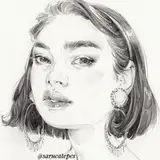
Hii! Here's a commission I did for a D&D character named Magdalena! I've been working on a lot of digital paintings recently, and it's been super fun to get back into!

2020-09-17 23:11:46 +0000 UTC
View Post
I've recently started taking commissions, and I just finished my first one in a long time.
Since I send progress shots to clients as I'm working on the process, I thought I would show you the steps as well!

1. My original sketch

2. The client wanted a bit of a softer look with upturned eyes, so I modified the sketch.

3. Base colors based on the character's description

4. The client wanted the darker gradient background, so I altered the colors and started painting the face.

5. Finished painting the details; she wanted the eyes a brighter yellow so that was the only change I needed to make since the last step.

6. Once the base painting was approved I added details! I added the flower petals and glows as well as highlights.

7. Color grading in Lightroom!

8. Final touches in RetroCam! I added grain, light streaks, and film scratches to complete the painting.
Hope you all have a great weekend!!
2020-08-23 00:39:05 +0000 UTC
View Post
Here's the full painting process for my new video. I'm going to edit tonight, just wanted to share the real-time with you!
2020-08-13 22:24:24 +0000 UTC
View Post
Hiiii! I wanna share the painting process for this piece; I used the Kuretake Gansai Travel Set that Kuretake sent to me to review!

I also used a flat Trekell brush for blocking in the first washes, the thinnest Kuretake water brush in the pack of three, the Zig clean color brushes, the Zig Clean Color Dots with the fineliner side, some Prismacolor pencils, and a GellyRoll gel pen at the end!

I started off on the Etchr Labs A4 cotton paper sketchbook; I've been testing this paper out with my other Western watercolor palettes, and I've been enjoying it a lot.
I used the Trekell brush to set down a base wash, and then waited for that to dry.

You can see how much the paints lightened after they dried, so this next layer was setting down more base tones, working off my reference photo and using the water brush that came with the travel set. I'm not gonna lie, I was a little disappointed with how muddy the colors were at this point. I know that Gansai paints shouldn't be mixed with too many other colors, or else they get muddy, but since shifting to more single pigment paints, I realized I wasn't being strategic with mixing.

I wanted to add more highlights to the painting, so I used the creamy white in the set. It looked so good with how the pigment moved on the paper and how opaque it was!! (Until it dried.....)
I kept added washes of brown, black and green mixed for the hair, trying to deepen the colors and texture!

As you can see, the white kinda diffused into nothing?! I added more details with the watercolor and the thinnest water brush, and then used the Zig Clean Color Brushes to add some details around the sides of the face, the nose, mouth, and eyes! These pens are DREAMY! The best part is that they can be activated with water, so if I went overboard with them, I could easily brush over them to diffuse them.

More mixing the fineliners and brushes, and then adding highlights with colored pencil! Added tons of freckles, details to the hair, and mixing different pens together! This is where everything starting coming together.

I added more details, and then the white gel pen for highlights. After finishing touches, the painting is finished!
This isn't my favorite, but I learned a lot by working with Gansai paints again, and I'm really happy to have salvaged the piece with the pencils and pens.
2020-08-13 18:21:30 +0000 UTC
View Post
HIIIII! Here's a little cottage sticker that I made the other day when hanging out with an art friend. My shop is currently closed, but I want to have small shop updates with curated products, so this is the first of my designs!

2020-08-13 16:53:26 +0000 UTC
View Post
Hey!
Here's the little update about why I had to take down my Netflix video and what happened afterwards! I wanna know your thoughts hahaha am I overreacting?
2020-08-09 21:15:25 +0000 UTC
View Post
Hello!
I've recently been really loving using my P. Cezanne colored pencils with the Legion Stonehenge White paper and experimenting with mixing colors and textures. I've been loving Chris Hong's colored pencil work, as well as Bao Pham's, so if you're looking for inspiration, I recommend them!
For this walkthrough, I want to share how I built up deep, curly hair to have dimension!

Starting off with a medium deep, chocolatey brown pencil, I draw soft, circular strokes as a base. I'm holding up the pencil so you can see what the tip looks like; I like for it to be really flat at this stage so that when I apply the first layer, it deposits very soft and light. Using the warm brown also will help develop colors and layers as you keep building.

This is what the first layer looks like after I finish it. I also have the color denser as it's closer to the head, and fade it out a bit as it would naturally thin out.

Next, I go in with a darker brown (like a dark chocolate/burnt umber shade) and use the same circular motions to deepen the color. I press a little harder (not gentle but still not saturating the paper with color), and keep the pencil *relatively" sharp. I wouldn't recommend constantly sharpening to a point, but it should be sharper than the first layer's pencil. Same technique as before, just a little harder and sharper!

This is what the second layer looks like after it's finished! Definitely not as deep as we want to go, but slowly building layers!

Next pencil color is an even darker brown (basically the brown before a black). Same as before, small circular motions. By this point, you'll have to be pressing down a lot harder than the first two layers to be able to see the pigment showing through, but don't apply max pressure just yet. At this point, be selective with how saturated you're applying the pencil; take bigger sections of hair and curls in mind, and try to shade around them as if there are shadows and highlights. As before, apply softer pressure around the ends and sections where the hair is less dense.

Finally time for the black colored pencil! Here you'll be applying the darkest sections, so be selective with what you color in darkest and which parts you let the brown peek through. if you look at how I shaded the front section, you can see I tried to create a gradient of black to brown dependant on the density of the hair. Make sure that you add loose baby hairs and stray pieces to break up the mass of the hair's shape!

And this is the finished product! I believe I used an orange or burnt sienna shade of colored pencil around the ends to make them appear more glowy and fluffy, so feel free to do the same!
Hopefully, this was useful to see my layering process! You can add different shades or colors depending on your desired end result; for example, if you want to do pink or red, think about what undertones you want to see in the hair and start off with those! Lastly, I've learned to use bright, saturated pigments when I want to layer this way. If you want to draw pink hair for example, I recommend maybe using an orange or bright pink lightly as the first layer rather than a baby pink. Stay away from colors that have an added white pigment to them when you want to layer!
2020-08-09 18:03:45 +0000 UTC
View Post
Hi!
It's funny that I should post July's rewards when I haven't even designed June's, BUTTT I have extra fun things I'm putting in all orders so you can't be mad at me hahaha! I'm adding the holo sticker to all packages as a thank you for your patience, and the third photo (the painting) is also an extra thank you postcard!


I am the literal worst when it comes to Patreon. I find it difficult to create good art, or at least art I'm satisfied with, while I'm behind or have a lot of things going on. For example, I redrew this month's postcard three? times before coming up with this one. The first was too cartoon-ish and I didn't love the proportions, and the second was way too "realistic" and mature. I have no idea how I came up with three wildly different paintings with the same pose, colors, and elements, but that's how erratic I am.


Because of this stress related art block, I've been trying something new with the stickers. The holo sticker is a completely different style than my usual, and the sticker pack isn't cohesive at all, but I had a blast designing both! I would love your input as to what you think of the style switch, but it really helped me step out of my funk.
I've also been facing a lot of hiccups in my process. My scanner software hasn't been working, and my very favorite tablet broke, so I had to find another one in my stash (and that completely threw off my process and began bugging my wrist). I'm sooo sad about the other tablet (the Huion HS610) because I was intending on making a review of it too! I'm gonna try to get it fixed since I know it's a pen issue.
Also, I have to tell you about my experience with Netflix on my promo painting for Cursed, and why I had to take down the video, but I will type out that story once there have been more developments. It's been kind of unprofessional, but we'll get to that soon!! Are you ready for me to be dramatic?
I'll be exporting a couple of the real-time process videos from my last paintings and uploading them for you, as well as the Procreate timelapse videos of the stickers!
2020-07-19 01:06:07 +0000 UTC
View Post
Hi hi! I hope you're all doing well; this is a little rant about why I'm so late on rewards and what's kind of going on with me at the moment. If you have suggestions on any of this, let me know! I want to make sure you're satisfied with content, so if you have a suggestion on maybe digital rewards to supplement your tier with, let me knowwwww! I would really appreciate it.
Enjoy watching me rant about my dumb printer.
2020-06-27 19:49:49 +0000 UTC
View Post
Hey guys! Here's the real-time process for May's postcard; I'll be printing and packaging rewards tonight!
2020-06-16 22:38:29 +0000 UTC
View Post
Hi hi!
Hope you're doing well; I finished the April and May sticker designs, but haven't sent out rewards just yet! I've been trying to work on Patreon content but the smallest things have been delaying content. I even filmed a vlog over a couple of days showing what a realistic work day looks like for me, but Premiere won't import the audio and I have no idea how to fix it!
So as soon as I figure that out, I'll have a vlog up for you guys.
I also made a bonus BLM sticker; what do you guys think? I don't know whether it's a good idea or insensitive (idk I'm a little nervous about it-- not the message, just sending it as a reward?? Idk) let me know if you guys want me to send the sticker, what your thoughts on it are, and if you have any suggestions!
2020-06-13 01:39:27 +0000 UTC
View Post
Hey guys,
How are you all doing? I'm not gonna lie, I've been taking all the recent events pretty hard, and I've been trying to process everything over the past couple of days. I haven't really been able to sketch or edit videos, which is super inconvenient. It's hard to talk about online, and it's hard to mention being depressed about all the recent events since nothing I say or feel will help or make anything right. But yeah, I don't have the right words for any of this, I just have been feeling really heavy.
Yesterday, I couldn't sleep so I randomly decided to redesign a local game store's logo. Super random, I know, but I haven't designed anything since school ended and I wanted to work on something personal, so I redesigned Dragon Fire Games Inc.

This is their logo at the moment; not great. Their focus is on trading cards and miniatures (so insane nerdy) so I wanted to go for one modern logo, one D&D style, and a retro/vintage feel.

The middle one is the most bland, but also I see it with illustrative elements pulling it together, but this is just something small I distracted myself with last night.
Hope you are all doing well and staying safe.
2020-05-31 02:13:10 +0000 UTC
View Post
Hi hi friends!!
I have had no wifi and one data service bar thing for the past week, so I haven't really been able to hop on and chat. I've coincidentally had to post tons of sponsored posts on Instagram during this insanely hectic time, which seems disingenuine but I can't really help that! Sponsored posts are something that really stress me out; I am soooo careful with who I accept sponsorships from (making sure they're gucci and not scams, not something trying to make money off my followers, and generally good causes) so even after my safety check, I get so freaked that my followers will think I'm trying to scam or get something from them through my sponsorships! Not the case, but hello anxiety my old friend.
I do wanna talk about the Dell and Alienware sponsorships; the Dell sponsorship was actually a tiny amount of remuneration for the video and posts. I accepted a super lowball offer for the posts just because I genuinely love Dell and thought it was INSANELY cool that they wanted to work with me for the Project Innovate redesign/launch. I got on a couple video calls with the directors of the project, and they were sooo genuine and cool and cute and sweet; like they kept telling me how much they liked my stuff and how they just wanted me to talk about Project Innovate in my own words. They didn't even give me bullet points, and they've been checking up on me with my move and health (no brands do that; it's super personal and sweet). So that's been so cool; I felt bad spamming on my Instagram about the giveaway (even though it's a giveaway and free stuff).
And then Alienware sent a super secretive email asking me to sign a non-disclusure if I wanted to know more about their secret project, and I signed it and hopped on a call with the guy pretty immediately. He was so sweet and kind as well and told me about how Alienware wants me to stream for the virtual E3 launch thing; LIKE LITERALLY BONKERS?? I have an Alienware, and I stan soooo hard?! And he was so feminist positive and telling me how the goal for this year was to sponsor and partner with more female creatives and gamers because they're very underrepresented in these industries. Oh my gosh, it was so cool. I'm beyond grateful and in shock of opportunities like these; obviously, I'm an influencer promoting a launch or giveaway. It's not like I'm doing an insane partnership and I'm the bee's knees, but to be thought of as a worthwhile influencer to support is so incredible. I'm so grateful for this and I'm mind-blown. And also the timing of opportunities like this is insane. This is the first time I've been in debt, ever. I've always been so careful with my money, and taxes, my downpayment, and this remodel completely wiped me out. I've had such bad anxiety and hard times thinking about how I'm going to work myself out of this, and the timing for this support is incredible. Like.. a super huge God thing. It makes me so unbelievably grateful.
Okay weird tired rambling over. I just wanted to share some positives that have been in my life recently. I've been hit hard by anxiety and being overwhelmed the past couple of weeks, so I'm trying to focus on the good things (and there are so many). Case in point, you guys! Even just emotionally, knowing you support me gives me so much peace, clarity, and calm and I am so overwhelmed by your love and generosity to me. In the past year, I've begun valuing kindness above a lot of positive attributes, and you guys have shown me sooo. much. kindness. I'm overwhelmed by your love and support (I could cry, and I have cried hahaha).
Let me know what rewards you want this month as I'm getting everything figured out. I'm not gonna have a sketchbook PDF just since I haven't had one second to sketch this past month, so let me know what I can put out for you!
Hope you are so well and healthy and in a good headspace!!!
2020-05-20 04:20:29 +0000 UTC
View Post
Hey guys! Hope you all are doing super well! I've been MIA with posting with my finals having just finished yesterday, as well as the bathroom remodel and packing my apartment up. I've been in a crazy hectic time, and just a heads up, I'll probs be a little MIA in the middle of this month with all the moving. I should still get the usual amount of rewards out for you (sketchbook pdf, real-time videos, some more check-ins and process stuff) but that's probably all gonna flood in at the end of the month!
Here is the final product that I created for my graphic design conceptual packaging assignment! It took so long to print, cut, fold, remake the template (since the original wasn't functional) and take photos of everything. My office is a mess, but at least the end result is something I'm proud of!


2020-05-05 19:39:12 +0000 UTC
View Post
Hey hey!
Here are updates on the tea packaging! I made these yesterday; we had to have the templates for our packaging done for today's critique, so I mapped out the template and designed the outside box for each of the tea types.


These are the boxes; I drew all the floral designs with ink in my sketchbook, scanned them in and vectorized them, and then kinda tiled them up freehand to make the pattern for each box inside!


I'll definitely show you the end result when I print them out, put the boxes together, put the jar packaging together and photograph everything! Coming this next week :-)
2020-04-24 00:48:55 +0000 UTC
View Post
Hiiii! So, I closed on Tuesday on my new house! I didn't post because I IMMEDIATELY started the bathroom remodel and have been working on that along with schoolwork.
This was the damage day one:

Bathtub and shower taken out, as well as a wall partially ripped up.
Yesterday:


Toilet removed, floors pulled up, one wall completely ripped up and the closet taken out!
Today, my mom worked on plumbing so I didn't do much other than sand some of the caulked up wall from yesterday. My boyfriend and I went to Lowe's to pick up cement boards for the floor and walls (and my mom met him for the first time today whoooo; she said he was cute).
Tomorrow, I'm heading over to Greensboro with him to pick up tiles for the floor. Don't worry, we're all staying safe and minimal people contact, lots of hand sanitizer, etc SHOWERS. But the show must go on, otherwise I don't have a bathroom when I move in less than 3 weeks ahhh!
Since this is the first time I'm actually doing things outside my apartment and moving around (as minimally as possible, but still out), send me a message here on Patreon if you're signed up for physical rewards and want me to hold off sending April's rewards until a certain time! I can definitely do that :-)
2020-04-24 00:38:56 +0000 UTC
View Post
Hey guys!
This is April's limited edition postcard (stickers will be posted but they'll have a similar theme). ALSO this painting is up in my shop https://www.sarucatepes.com/shop/august-2019-sketch-3-5n56n-6j3wc-6pbpa-exgw4-fsp56 and I'll be putting in a spring sticker pack with this order! Be sure to use the code BANANA20 for 20% off this painting.
2020-04-19 14:59:43 +0000 UTC
View Post
Hey everyone!
Today I tried out my new handmade watercolors from PoemsAboutYou. I recorded the painting process for a review on my Youtube channel, but I wanted to talk you through the painting step by step!

First off, I did a couple swatches mixing various colors and seeing how everything bleeds, lifts, mixes, and granulates. I did some research on the individual colors that I purchased, seeing which ones granulate and are transparent, so I tried to be mindful with how many colors I mixed and preserving luminosity.

I used a Prismacolor Col-Erase pencil in Terra Cotta to sketch out the figure on Arches hot press paper. I don't love hot press paper, and I knew this was going to be a little bit of a challenge for me, but I wanted to use a higher quality paper because I wanted to take my time, and I knew I might have to lift the paints since I've never used them before.

I taped off the paper with washi tape to mask the paper off and make sure I have a crisp edge at the end of the painting.

I began blocking in rough colors and shapes, and I already began struggling with the paper. I haaaattte hot press paper :( The beginning stages of the watercolor process look so ugly, and it takes a lot of patience and vision to see what the end result will look like despite all the ugly bits.

Adding more colors, the paints are bleeding weirdly into the paper. This is the reason I don't like this paper, buuuut I know I'm in the minority. Hot press paper is just not forgiving. These paints lift well. I don't use a lot of lifting in my paintings if I can help it, so it's a little bit frustrating when colors lift too much on me (as you can see is happening with the cheek).

I started using the Genuine Mayan Green for the background, and this color is incredible. I love this dark deep green, and I love the contrast between that and the bright orange tones in the face.

I painted the rest of the background with Indigo; also what a showstopping color!! I 100% recommend both of these colors. They're so rich and pigmented, and they dry with the same vibrancy. I used a mix of my Trekell brushes with the Beste brushes I've been loving recently.

I started to add some warm shadow tones and deepening the values. Adding some of the Azurite around the eyes and earrings.

I added some of the Geniune Mayan Green to the leafy bits in her hair and around her eyes. I usually start to add darker details way earlier, but these paints definitely need to be layered up, so I patiently took my time added layers to the face.

Lifting more around the eyes, darkening shadows.

Mixed the Tyrian Cobalt Purple to the Indian Red for the deeper tones in the hair, and added that color to the eyebrows and eye shadows.

I continued to deepen the tones in the hair, adding the same color to the shadows on the back and then adding some warmer tones to make sure the skin still looks like it's glowing. I added a second wash to the background to make sure everything looks rich and deep, and detailed around the edges of the face to smooth everything out.

Deepening the background more.

Adding more pinks and oranges and adding some darker tones to the longer strands of hair.

I added some small ink details with my purple Hi-Tec-C pen, and then added highlights with the my Gelly Roll gel pen. This is where the piece really came together, especially with the highlight on the nose!


I pulled the washi tape off the paper and this is the final painting!
I really love the final outcome, and these paints are so fun. I 100% recommend them. If you want swatches and names of the colors I have, as well as links, LET ME KNOWWW!
2020-04-17 22:34:19 +0000 UTC
View Post
Hi! How are you doing today?
I've had a long morning by now, planning house and remodeling things, getting ready for class and working on assignments, and later, I would really like to begin working on April's Patreon postcard and recording the process of painting that! I want to use this new set of handmade watercolors that I purchased from PoemsAboutYou: https://www.etsy.com/shop/poemsaboutyou
I was really curious to try handmade watercolors, support a smaller, pretty local business esp during this time, and also try some single pigment, quality watercolors! I'm absolutely in love with these colors, and if you want a more in-depth look at the colors and pigments, let me know and I'll make a post about them!

Secondly, this is the identity I created for the conceptual tea brand packaging! There are quite a couple logo variations, and we'll see what my professor has to say about the project, but I'm really jazzed with the direction this is heading in! It's very simple, and I feel like I could push myself farther, BUT I've never done a minimal, classic design project like this and I definitely think that by the end of it, I'll have a great portfolio piece.
Lastly! Here are some photos I've been taking for my photography portfolio class! Since quarantine, our classes have moved online and the assignments for photography class have shifted to be creative daily photos during quarantine, and I thought I'd share some of the photos I've taken! Have a wonderful day! Lots of hugs!


2020-04-16 16:50:10 +0000 UTC
View Post
Hey everyone!
This is the real time drawing process for a Patreon sketch for Erin! She asked me to draw Eleven, and I had such a fun time doing this! I've been loving colored pencils recently, and they're just what I needed to get out of my creative rut!
I just wanted to say that if you're interested in the monthly original sketch tier, I've begun taking requests (if you send me two or three things you'd like to see for your sketch, I might draw them if they're not too complex!) ALSOOOO the tier says that the drawing or painting is 5"x7", and I've started to draw and send bigger sketches and drawings (because I don't want to be limited to 5"x7"). I'm trying to have more fun with these, and it's been a blast! SO, I'm going to leave the tier description as 5"x7", since I'm still drawing some that size, but you can expect maybe a larger drawing? BASICALLY, at least a 5"x7" drawing or painting, you can expect that I'll draw what you want within reason, and I'm going to be having too much fun with your drawing.
Okey update over hahaha! Hugs hugs :)
2020-04-15 15:58:23 +0000 UTC
View Post
Hi! Hope you're having a great day!
Today I wanted to share a new school project I have to work on! It's a conceptual packaging design project, and you can check out the pdf attached for my proposal (I didn't realize I needed to have it done in class today, so I did it super quickly in two hours, don't judge!)
I want to real-time share how I go through the process of designing something since it's something I'm not great at, and I think it would be cool to get your feedback on this!
The prompt for this project was to take a well-rounded character from a movie, show, or book, who shows a lot of character development, and create a series of products themed around them. Randomly, I was the only person to choose a pretty indie character (everyone else did Michael Scott or Leslie Knope or Ron Swanson), and I chose Renee Michel from the book "The Elegance of the Hedgehog" by Muriel Barberry (this is also a really good movie, but I can't find it ANYWHERE online!)
The character I chose is the concierge for a really bougie French apartment complex. She's super prickly and pessimistic, and the main character of this book, Paloma, is an 11 year old girl who, after seeing all these super messed up adults in her life, decides she doesn't want to become one, and that she'll commit suicide by her 12th birthday. Between that time, she uses her dad's old camcorder (super 8?) and records everything going on around her, becoming friends with the concierge and learning a lot about adults during the process. It's a really beautiful, pessimistic work, and it talks a lot about the meaninglessness of everything, but also the beauty in little, useless things, and I decided to base my brand around Renee.
I read this book and watched the movie soooo long ago, so I am definitely remembering everything incorrectly, but I really liked the message. I decided to make a line of loose leaf teas, since tea is a big thing in the book. I'm going to go with a pretty minimal, classic aesthetic, and you can look at my moodboard for what the general idea I have.
Anyway! I thought this would be interesting to share with you as I'm working on it day by day. I'm going to be finishing the identity package for this tomorrow evening, so be sure to check back for that soon!
2020-04-14 21:19:17 +0000 UTC
View Post
Hi hi! Happy Easter!
I hope you're doing well and safe and as happy as can be. I've been starting to organize my schedule better in the past couple of months, and I've begun letting myself take weekends instead of pressuring myself to work and feeling guilty if I rest. I don't always take Saturday and Sunday as rest days, but it means that two days a week I let myself have down time (and just catch up on the weekend if I took a weekday off).
That's been this weekend! I took Friday off; lots of cooking, cleaning, TV, chilling. Then yesterday too! I just didn't feel like doing busy work, so I watched Youtube and planned for Patreon and my fairy book, and went to bed early. Today's been a productive day; I know it's Easter, but I'm alone and felt like getting chores out of the way!
I've been editing a video with a Skillshare sponsorship since Thursday, and I let myself chip at it slowly every day until I just finished it right now and sent it for review. Big sigh of relief. I can take that off my mind and work on other important things! INCLUDING: (I'm not 100% sure) but I'm scheduled to close on my house on THURSDAY?! I'm gonna call my realtor and loan officer tomorrow to let me know what the status of everything is and if we're ready to close, but I'm so excited and scared!
This is gonna be the first time since I was 16 that I haven't had any savings; I had to pay my taxes early this year so I could get approved for my loan, so that was an unexpected wipeout of half of my savings, and then the rest goes to my downpayment. I don't even have money for the early termination fee for my apartment complex or for the renovations I need to do for the bathroom of my new house. But I'm gonna get a small loan and hopefully manage to pay it off in two or three months. This is literally insane; I'm freaking out but also, I've been freaking out for so long that I'm used to it. I'm sooo excited!
In other terms, I want to get my fairy book done as quickly as possible so I can start preorders, and finish this project. It's been looming over me for a couple of months, and I want it to already be finished! I'll try to get the resting of the paintings and drawings done this week, and then plan all the preorder free goodies+ a collection of a couple prints, stickers, postcards, temporary tattoos?! that are all fairy themed and can go with the zine. AHHH! Big plans; watch me not do anything productive this week.
How are you doing? Did you have a good Easter and weekend? Lemme know! Big hugs.
2020-04-12 23:18:42 +0000 UTC
View Post
Hey guys! This is a sneak peak for a video that I'm editing today. The video is using inexpensive art supplies, and I painted it using the Koh-I-Noor watercolor stack pack (set of 24 colors for $9.42 off Blick). This is the first watercolor set I bought myself when I was getting serious about art and wanted to try watercolors. I remember really loving this set and thinking it was pigmented and rich.

I started off with a pencil drawing on 11"x15" Canson XL Watercolor Paper with a Bic 0.5 mm pencil; the paper is $0.27 a sheet with the 50% off coupon from Michaels, and the pencil is $0.20 out of a pack of 12 for $2.37 from Target. (I don't know if you really care about the math, but I did it anyway hahah!)

Since my reference photo was cut off halfway down the face, I washi-taped the borders so the paint would be confined and I'd have a cool border at the end of this.

Unfortunately, even with the insanely positive attitude I came to these paints with, they did not fail to disappoint me. The colors in this set are so chalky, dull, and not pigmented, and this painting was a huge struggle for me.
I'm definitely not judging if you have this set and enjoy it (I really loved it when I was starting off), but after trying better paints for a small budget, I don't know if I could recommend these.

Lucky for me, these paints did have a bright magenta color that I was able to create contrast and punchy colors with. This pink was the only color in the set that had any sort of pigment, so in the end, I used it straight out of the pan for most of the painting, and mixed it with some of the blues for a darker purple shadow tone.

The pink did layer well; even though it was still chalky, it was pigmented.

I even managed to get a really beautiful slate grey with the magenta, blue, and black! This was the most enjoyable phase of this painting. Even though the paints are chalky and the pigment doesn't move when it's placed on the paper, they layered well and even lifted pretty well too!

Luckily, the paints don't reactivate quickly on the paper, so they layer really well.

At this point, I started to have a lot of difficulties creating good shadow tones. The skin tones in the set weren't pigmented and didn't reach deeper tones, so I was forced to use the pinks and purples for shadows. I kept lifting these colors off of the chin, since the cooler tones made her look like she had five o'clock shadow (oh my gosh).
I had been painting for about two hours by this point, which, for what I'm painting, is a long time for me.

The hair was looking so ugly, that I thought to use salt to create a cool galaxy effect. I don't know if I just needed larger salt crystals, or the paint/paper combo suuuucked, but this didn't turn out, and I ended up having to scrape the dried salt off of the paper hahahaha.

I ended up using the black for finishing touches, going over the face with a ballpoint pen and my mechanical pencil to add some details. Luckily for me, this set does have a pretty opaque white (which I was skeptical would do anything), but it allowed me to add highlights on the face!!

If you look at the paints on the palette, you can see how much the pigments break up.

And here's the final painting! Since there is no lightfastness information on these paints (and I can tell they'd fade instantly), I'm not going to be selling this painting and will probably just hang it up somewhere in my place.
In conclusion, I do think it is possible to make insanely cheap art supplies work, especially if you have the time and patience to put yourself through this torture, but I don't recommend these paints as quality supplies. I feel that for a quick study or travel watercolor set, they perform better than the Winsor and Newton Cotman Set (I HATE THAT SET), and they layer and lift well. HOWEVER, most of the colors are not pigmented, and all of the colors are extremely chalky and hard to activate.
Let me know your thoughts! Do you like seeing processes like this?
2020-04-10 17:19:01 +0000 UTC
View Post
Hey guys!
I've been trying to make my Patreon cuter, and one thing I didn't love with my tiers were their names and how I didn't have any little thumbnails for them, so I decided to rename them and make some cute illustrations!
How do you guys feel about these new tiers?? Are you happy with them or did you like them more before?
2020-04-07 18:54:39 +0000 UTC
View Post
Here's the quick Procreate process for the new Patreon tiers! I didn't love the names of the previous tiers, so I decided to work on something I was satisfied with, and I really like the outcome of these little drawings!
How do you guys feel about these new tiers?? Are you happy with them or did you like them more before?
2020-04-07 18:53:12 +0000 UTC
View Post
I just added a new reward for all patrons, which is a 20% off discount code on all my shop products!
You can use the code BANANA20 whenever you want to pick something up!
Thanks for being so awesome :-)
Hugs,
Sara
2020-04-07 16:29:31 +0000 UTC
View Post
Here's the Procreate process video of my new spring stickers! You can check out my previous post for the little walkthrough of how I made them from start to finish!
2020-04-06 00:48:05 +0000 UTC
View Post
Hey guys! I wanted to show you some of my Procreate process for how I design stickers from start to finish.

I first take a photo of my pencil sketch so I can import it to Procreate and sketch over it. The photo doesn't have to be crazy good quality since I'm just going to trace over it and then delete it.


I use the Small Ink brush from the Dry Texture Procreate Brush pack: https://www.designcuts.com/product/dry-texture-brushes-for-procreate/
I usually line in a warm, dark brown since it looks more natural.

This is what the lineart looks like after it's all completed and the under sketch has been removed. Inking in Procreate was a little bit of a learning curve for me, but I really recommend the Dry Texture Brush Pack for a good variety of traditional looking brushes!


I block in the colors for the stickers in different layers, just so that I can shade and texture everything easily later on. I make one layer for the browns, one for the greens, etc.


My canvas size is an 8x10 in. which has a maximum of five layers allowed, so as I finish different layers, I merge them together in order to add more layers on top for the glows and highlights.
To start shading and adding details, I will alpha lock each layer and begin shading with the default 6b Pencil in the Sketching tab, as well as with the Soft Airbrush, and some of the brushes in the Sargent Oils Brush Pack: https://www.designcuts.com/product/sargents-oils-procreate-brushes/?gclid=CjwKCAjwg6b0BRBMEiwANd1_SAwhUbI5u8XhaXQTzXBcvaBASMwk582ElOq_j0Uz1QOlJLsbP3E8YRoC42wQAvD_BwE
Once all of the details are completed, I go over with the Soft Airbrush and an overlay layer just to add some glowy highlights.

On top of that, I'll use the same inking brush from before to add some white highlights, reflections, and fairy glows.
Since I want these to be clear stickers, I export in PNG without a background layer, and I always take my designs and paintings into Adobe Lightroom to add a filter and some color adjustments for unity.

Here are the final stickers! I'll upload photos of them when they arrive, and again, they will have clear backgrounds, but just for this upload's sake, I added a slight background color so you can see the designs better.
Hopefully this was a little bit insightful for you! Let me know if you have any questions!
Happy Sunday. :)
2020-04-06 00:19:21 +0000 UTC
View Post
Good morning! It’s 12:30 and I’m in pajamas, drinking my coffee, watching some art YouTube, and working on these stickers before starting my day.
I just finished lining the designs I showed you yesterday, and I’ll start on colors later tonight. I’ll have a process post once I’m done with the designs, but I SUUUCK at keeping secrets so I’m definitely gonna share these with you right now anyway.
Yesterday and today I’ve tried to start my day with breakfast or coffee, some YouTube and Procreate. It’s been fantastic; I’ve felt inspired and it’s been a great warm up for the day. Hopefully I’ll keep it up!
Today I have to record a YouTube video; it’s gonna be a digital painting for the #drawthisinyourstyle tag, so I’m thinking of making a springy painting with lots of pastels and breezy, flows dresses and hair. Ahhh I’m so excited!
Okey thanks for checking in with me today! Hope you do something fuuuun today!!
2020-04-03 16:51:47 +0000 UTC
View Post